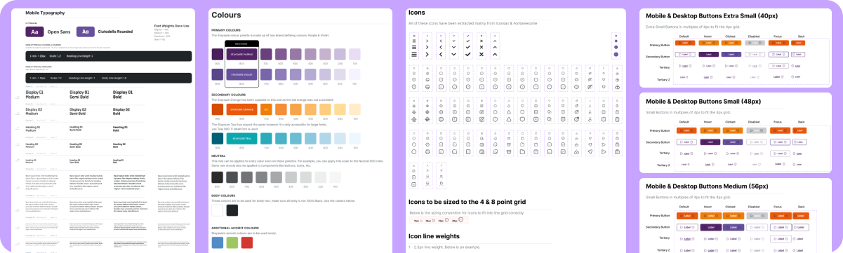
Staysure Design System
A shared language for seamless collaboration. Build consistent, beautiful products with total confidence.
This design system is a collection of guidelines, principles, components, and assets that are used to create consistent and cohesive user interfaces across different products and platforms. It's a set of rules and tools that helps designers and developers create consistent, usable, and aesthetically pleasing products.
The main purpose for this design system is to establish a shared language among the design team, the development team, and other stakeholders, to ensure that everyone is on the same page about how to design, develop, and implement the product. A design system typically includes elements such as typography, colour palettes, icons, buttons, forms, layout guidelines, and interaction patterns.
By using the Staysure design system, teams can save time and reduce the risk of errors and inconsistencies in their products. It also helps to create a better user experience by ensuring that users have a consistent and predictable experience across different products and platforms.

Client
Staysure
Role
Senior UX/ UI Designer
Team
2 Designers, 2 Developers and 2PM
Timeframe
Apr 2022 - Jan 2023
The Problem
The primary challenge was the pace of delivery. Each co-branded site had a very short turnaround, often just two to three days from brief to final design. This meant quickly understanding new brand guidelines, campaign objectives, and audience expectations, while still maintaining a high standard of creative and strategic thinking.
The Project Goals
The goal of these projects was to create premium co-branded digital experiences that successfully balanced the identity of two brands within a single, cohesive campaign. Every page needed to communicate the partner brand's message while remaining authentic to the visual language and audience expectations of Global's radio stations. Alongside creating visually engaging experiences, the designs needed to encourage participation, strengthen brand awareness, and support measurable commercial outcomes.

View the Design System
Atomic Design Methodology by Brad Frost
In the natural world, atomic elements combine together to form molecules. These molecules can combine further to form relatively complex organisms. To expound a bit further:
- ⚛️ Atoms are the basic building blocks of all matter. Each chemical element has distinct properties, and they can’t be broken down further without losing their meaning. (Yes, it’s true atoms are composed of even smaller bits like protons, electrons, and neutrons, but atoms are the smallest functional unit.)
- 🧬 Molecules are groups of two or more atoms held together by chemical bonds. These combinations of atoms take on their own unique properties, and become more tangible and operational than atoms.
- 🦠 Organisms are assemblies of molecules functioning together as a unit. These relatively complex structures can range from single-celled organisms all the way up to incredibly sophisticated organisms like human beings.
Atomic design is not a linear process, but rather a mental model to help us think of our user interfaces as both a cohesive whole and a collection of parts at the same time. Each of the five stages plays a key role in the hierarchy of our interface design systems. Let’s dive into each stage in a bit more detail.

My Process
Documenting
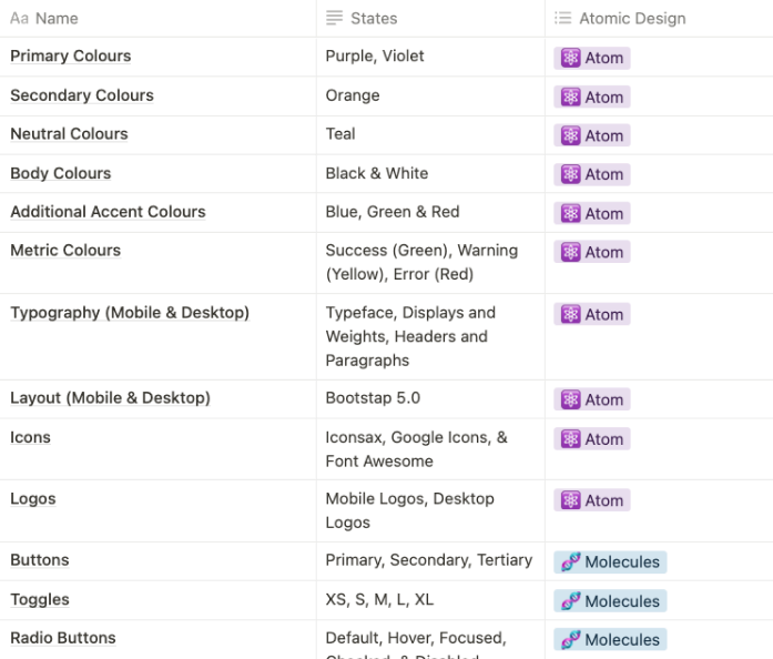
The first thing I do before starting to design my system is create a spreadsheet of all the components and the states we have for each. This make it very easy to tick off as I’m designing and making sure I know i’ve looked through every component to see if they need updating or can live in the design system as is.
In this document, I split components down into the atomic design. So every atomic item i will need and what atoms go into molecules and what molecules go into organisms, etc.
During this process will decide was it good and bad, then i know i need to redesign the bad. How I decide this is by:
- Bad UX practices
- Looking at data to see where the users are struggling
- Will the components match the new style
- Understanding the developers limitations
Creating Atoms
Each atom in the natural world has its own unique properties. A hydrogen atom contains one electron, while a helium atom contains two. These intrinsic chemical properties have profound effects on their application (for example, the Hindenburg explosion was so catastrophic because the airship was filled with extremely flammable hydrogen gas versus inert helium gas). In the same manner, each interface atom has its own unique properties, such as the dimensions of a hero image, or the font size of a primary heading. These innate properties influence how each atom should be applied to the broader user interface system.
In the context of a pattern library, atoms demonstrate all your base styles at a glance, which can be a helpful reference to keep coming back to as you develop and maintain your design system. But like atoms in the natural world, interface atoms don’t exist in a vacuum and only really come to life with application.
Understanding Colour
Making sure you get the right colour is very important. This insures that it is accessible to everyone. One of the main ways I found that the colour works for everyone is by using a contrast checker that tests if the colour works with WCAG AA & AAA standards. I started by taking the colours that the stakeholder and the 3rd party was using previously, and work around contract checker to make sure they fit in the guidelines of WCAG AA & AAA standards. After I have my main colours, i’ll work with Google’s Material Design to get the ascending and descending colours.
Layouts & Grids
Grids are essential for a constant design system that also helps the handover to developers. We took the layouts and grids from Bootstrap 5.0, as this is what our developers were using previously. This grid system is great for making mobile design and desktop design work together and helps create responsive design.
Iconography
System icons are designed to be simple, modern, friendly, and sometimes quirky. Each icon is reduced to its minimal form, expressing essential characteristics. These Icons are a mix between Google Icons, Font Awesome, and Vuesax Icons. We picked a two tone icons, as we felt it would best match the consistency of the brand guidelines.
Typography
My Typography best practice:
- Keep the number of fonts used at a minimum
- Choose the proper font size
- Justify left and mind the gap
- Choose a typeface that works well in various sizes
- Limit line length (40 - 60 characters per line)
- Avoid all caps
- Line spacing (Font size + 30% of font size)
- Use Contract Checker
I used the fonts from the 3rd party and added these rules to make it work everywhere
Creating Molecules
In chemistry, molecules are groups of atoms bonded together that take on distinct new properties. For instance, water molecules and hydrogen peroxide molecules have their own unique properties and behave quite differently, even though they’re made up of the same atomic elements (hydrogen and oxygen).
In interfaces, molecules are relatively simple groups of UI elements functioning together as a unit. For example, a form label, search input, and button can join together to create a search form molecule.
When combined, these abstract atoms suddenly have purpose. The label atom now defines the input atom. Clicking the button atom now submits the form. The result is a simple, portable, reusable component that can be dropped in anywhere search functionality is needed.
Now, assembling elements into simple functioning groups is something we’ve always done to construct user interfaces. But dedicating a stage in the atomic design methodology to these relatively simple components affords us a few key insights.
Buttons & Checkboxes
Buttons are made from three atoms - Colour + Icon + Typography = Button
Toggles, radio buttons and checkboxes = Colour + Typography
Are methodology for primary and secondary buttons was that they always had to be contrast to the background. This way it will always grabs the users attention and they will know where to go next.
Input Fields
Input field = Colour + Icon + Typography
4 States of input field:
Default
Warning
Error
Success
I already knew what states of input fields I needed, due to me going through the projects and listing every component and state out already.
Creating Organisms
Organisms are relatively complex UI components composed of groups of molecules and/or atoms and/or other organisms. These organisms form distinct sections of an interface.
Let’s revisit our search form molecule. A search form can often be found in the header of many web experiences, so let’s put that search form molecule into the context of a header organism.
The header forms a standalone section of an interface, even though it contains several smaller pieces of interface with their own unique properties and functionality.
Organisms can consist of similar or different molecule types. A header organism might consist of dissimilar elements such as a logo image, primary navigation list, and search form. We see these types of organisms on almost every website we visit.
Building Templates
Templates are page-level objects that place components into a layout and articulate the design’s underlying content structure. To build on our previous example, we can take the header organism and apply it to a homepage template.
This homepage template displays all the necessary page components functioning together, which provides context for these relatively abstract molecules and organisms. When crafting an effective design system, it’s critical to demonstrate how components look and function together in the context of a layout to prove the parts add up to a well-functioning whole. We’ll discuss this more in a bit.
The Process
Every project starts with understanding the problem before designing a solution. I use the Double Diamond design process as a guide because it keeps the work focused on real user needs while ensuring the final product meets business goals.
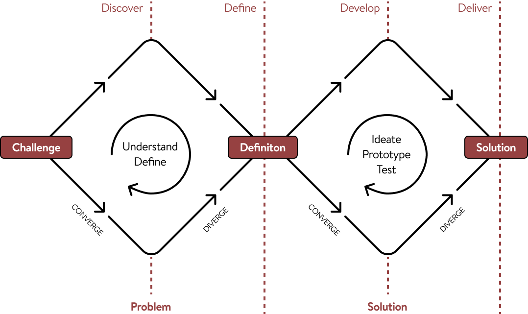
Discover (Understanding the Problem)
Before opening Figma, I take time to learn about the business, the users, and the challenges they're facing.
This might include:
- Learning about your business goals
- Understanding your target audience
- Reviewing existing products or websites
- Looking at competitors and industry trends
- Identifying pain points and opportunities
The goal is to build a clear picture of what needs to be solved—not just what needs to be designed.
Define (Creating a Clear Direction)
Once the research is complete, I organise the findings into a clear plan.
During this stage, I:
- Prioritise the biggest user and business needs
- Define project goals
- Map out user journeys
- Decide which features or pages will have the greatest impact
This creates a strong foundation before moving into design, helping avoid unnecessary revisions later.
Develop (Exploring Solutions)
With a clear direction in place, I begin designing and testing ideas.
This typically includes:
- Wireframes
- User flows
- Interface design
- Interactive prototypes
- Gathering feedback and refining the design
Rather than settling on the first idea, I explore different approaches to find the solution that works best for both users and the business.
Deliver (Building the Final Product)
The final stage is about turning the chosen solution into something ready to launch. This includes:
- High-fidelity UI designs
- Design systems and components
- Developer handoff
- Final quality checks
- Support during implementation when needed
The result is a polished, user-focused product that is designed to solve real problems, not just look good.
Why This Process Matters
Following a structured design process helps reduce guesswork, keeps projects aligned with business goals, and ensures every design decision has a purpose.
It also creates better communication throughout the project, giving clients visibility into each stage and confidence that we're solving the right problem before investing time in the final design.


Say Hello
I’m open for freelance and permanent role opportunities. Or simply say hello, if you like the site!
LinkedIn
me@alexwaters.co.ukSite designed and built by Alex Waters
©2026
Staysure Design System
A shared language for seamless collaboration. Build consistent, beautiful products with total confidence.
This design system is a collection of guidelines, principles, components, and assets that are used to create consistent and cohesive user interfaces across different products and platforms. It's a set of rules and tools that helps designers and developers create consistent, usable, and aesthetically pleasing products.
The main purpose for this design system is to establish a shared language among the design team, the development team, and other stakeholders, to ensure that everyone is on the same page about how to design, develop, and implement the product. A design system typically includes elements such as typography, colour palettes, icons, buttons, forms, layout guidelines, and interaction patterns.
By using the Staysure design system, teams can save time and reduce the risk of errors and inconsistencies in their products. It also helps to create a better user experience by ensuring that users have a consistent and predictable experience across different products and platforms.

Client
Staysure
Role
Senior UX/ UI Designer
Team
2 Designers, 2 Developers and 2PM
Timeframe
Apr 2022 - Jan 2023
View the Design System
Highlights
I led a research and design process, supported by a talented team of POs, and developers while working remotely and in the London WeWork office. Our efforts led to the discovery of valuable user insights, numerous user experience improvements, and a validated long-term design direction for the future development.
- Keeping consistent, throughout every change that was made.
- Existing value was unlocked, by revamping the design process and navigation to really focus on the needs of customers. These findings can also be brought over to other brands in the business.
- A beautiful, easy-to-understand mobile journey, this is done by designing mobile first (as “The latest figures from Statcounter show that in the UK, mobile and tablet combined account for 52.4% of market share when browsing” (Jeanne Wilkins • Aug 28, 2020)). This statistic is only going to get high as every industry designs for mobile.
The Brief
Before joining Staysure, there was an old style guide that a third party made for us, this was a great place to start while bringing in my expertise that I've learnt from other companies. This meant that I have had the freedom to make the style guide more modern while keeping a demographic of older generation in mind. I did this by Going through the discovery phase and see what other people in the industry are doing.
Objective
- Redesign the design system, to help build a easier and consistent journey for customer and other users.
- Create a UX/UI process, to help all featured teams help build the product.
- Role out a MVP Staysure product to get data and feedback to help create version 2.
What is a Design System?
A design system is a collection of design elements, principles, and guidelines that are used to ensure consistency and coherence in the design of digital products and services. It is a set of rules and tools that helps designers and developers create a unified, coherent user experience across multiple platforms and products.
A typical design system includes elements such as typography, color palettes, icons, imagery, spacing, layout, and interaction patterns. It also includes guidelines on how to use these elements and principles to create a consistent and cohesive user interface.
Design systems are important because they help teams work more efficiently and effectively. They save time by providing a consistent set of design elements that can be reused across different products and services. They also ensure that the user experience is consistent and predictable, which helps to build trust and loyalty among users.
“A design system is a set of standards to manage design at scale by reducing redundancy while creating a shared language and visual consistency across different pages and channels.” - NNG 2021
The benefits of Design Systems are:
- Design and Development work can be created and replicated quickly and at scale.
- Allows focus on larger and more complex problems (as the simpler UI elements are already created).
- Create a unified language between teams.
- Creates visual consistency across products.
Atomic Design Methodology by Brad Frost
In the natural world, atomic elements combine together to form molecules. These molecules can combine further to form relatively complex organisms. To expound a bit further:
- ⚛️ Atoms are the basic building blocks of all matter. Each chemical element has distinct properties, and they can’t be broken down further without losing their meaning. (Yes, it’s true atoms are composed of even smaller bits like protons, electrons, and neutrons, but atoms are the smallest functional unit.)
- 🧬 Molecules are groups of two or more atoms held together by chemical bonds. These combinations of atoms take on their own unique properties, and become more tangible and operational than atoms.
- 🦠 Organisms are assemblies of molecules functioning together as a unit. These relatively complex structures can range from single-celled organisms all the way up to incredibly sophisticated organisms like human beings.
Atomic design is not a linear process, but rather a mental model to help us think of our user interfaces as both a cohesive whole and a collection of parts at the same time. Each of the five stages plays a key role in the hierarchy of our interface design systems. Let’s dive into each stage in a bit more detail.
My Process
Documenting
The first thing I do before starting to design my system is create a spreadsheet of all the components and the states we have for each. This make it very easy to tick off as I’m designing and making sure I know i’ve looked through every component to see if they need updating or can live in the design system as is.
In this document, I split components down into the atomic design. So every atomic item i will need and what atoms go into molecules and what molecules go into organisms, etc.
During this process will decide was it good and bad, then i know i need to redesign the bad. How I decide this is by:
- Bad UX practices
- Looking at data to see where the users are struggling
- Will the components match the new style
- Understanding the developers limitations
Creating Atoms
Each atom in the natural world has its own unique properties. A hydrogen atom contains one electron, while a helium atom contains two. These intrinsic chemical properties have profound effects on their application (for example, the Hindenburg explosion was so catastrophic because the airship was filled with extremely flammable hydrogen gas versus inert helium gas). In the same manner, each interface atom has its own unique properties, such as the dimensions of a hero image, or the font size of a primary heading. These innate properties influence how each atom should be applied to the broader user interface system.
In the context of a pattern library, atoms demonstrate all your base styles at a glance, which can be a helpful reference to keep coming back to as you develop and maintain your design system. But like atoms in the natural world, interface atoms don’t exist in a vacuum and only really come to life with application.
Understanding Colour
Making sure you get the right colour is very important. This insures that it is accessible to everyone. One of the main ways I found that the colour works for everyone is by using a contrast checker that tests if the colour works with WCAG AA & AAA standards. I started by taking the colours that the stakeholder and the 3rd party was using previously, and work around contract checker to make sure they fit in the guidelines of WCAG AA & AAA standards. After I have my main colours, i’ll work with Google’s Material Design to get the ascending and descending colours.
Layouts & Grids
Grids are essential for a constant design system that also helps the handover to developers. We took the layouts and grids from Bootstrap 5.0, as this is what our developers were using previously. This grid system is great for making mobile design and desktop design work together and helps create responsive design.
Iconography
System icons are designed to be simple, modern, friendly, and sometimes quirky. Each icon is reduced to its minimal form, expressing essential characteristics. These Icons are a mix between Google Icons, Font Awesome, and Vuesax Icons. We picked a two tone icons, as we felt it would best match the consistency of the brand guidelines.
Typography
My Typography best practice:
- Keep the number of fonts used at a minimum
- Choose the proper font size
- Justify left and mind the gap
- Choose a typeface that works well in various sizes
- Limit line length (40 - 60 characters per line)
- Avoid all caps
- Line spacing (Font size + 30% of font size)
- Use Contract Checker
I used the fonts from the 3rd party and added these rules to make it work everywhere
Creating Molecules
In chemistry, molecules are groups of atoms bonded together that take on distinct new properties. For instance, water molecules and hydrogen peroxide molecules have their own unique properties and behave quite differently, even though they’re made up of the same atomic elements (hydrogen and oxygen).
In interfaces, molecules are relatively simple groups of UI elements functioning together as a unit. For example, a form label, search input, and button can join together to create a search form molecule.
When combined, these abstract atoms suddenly have purpose. The label atom now defines the input atom. Clicking the button atom now submits the form. The result is a simple, portable, reusable component that can be dropped in anywhere search functionality is needed.
Now, assembling elements into simple functioning groups is something we’ve always done to construct user interfaces. But dedicating a stage in the atomic design methodology to these relatively simple components affords us a few key insights.
Buttons & Checkboxes
Buttons are made from three atoms - Colour + Icon + Typography = Button
Toggles, radio buttons and checkboxes = Colour + Typography
Are methodology for primary and secondary buttons was that they always had to be contrast to the background. This way it will always grabs the users attention and they will know where to go next.
Input Fields
Input field = Colour + Icon + Typography
4 States of input field:
Default
Warning
Error
Success
I already knew what states of input fields I needed, due to me going through the projects and listing every component and state out already.
Creating Organisms
Organisms are relatively complex UI components composed of groups of molecules and/or atoms and/or other organisms. These organisms form distinct sections of an interface.
Let’s revisit our search form molecule. A search form can often be found in the header of many web experiences, so let’s put that search form molecule into the context of a header organism.
The header forms a standalone section of an interface, even though it contains several smaller pieces of interface with their own unique properties and functionality.
Organisms can consist of similar or different molecule types. A header organism might consist of dissimilar elements such as a logo image, primary navigation list, and search form. We see these types of organisms on almost every website we visit.
Building Templates
Templates are page-level objects that place components into a layout and articulate the design’s underlying content structure. To build on our previous example, we can take the header organism and apply it to a homepage template.
This homepage template displays all the necessary page components functioning together, which provides context for these relatively abstract molecules and organisms. When crafting an effective design system, it’s critical to demonstrate how components look and function together in the context of a layout to prove the parts add up to a well-functioning whole. We’ll discuss this more in a bit.
View the Design System
The Process
Every project starts with understanding the problem before designing a solution. I use the Double Diamond design process as a guide because it keeps the work focused on real user needs while ensuring the final product meets business goals.
Discover (Understanding the Problem)
Before opening Figma, I take time to learn about the business, the users, and the challenges they're facing.
This might include:
- Learning about your business goals
- Understanding your target audience
- Reviewing existing products or websites
- Looking at competitors and industry trends
- Identifying pain points and opportunities
The goal is to build a clear picture of what needs to be solved—not just what needs to be designed.
Define (Creating a Clear Direction)
Once the research is complete, I organise the findings into a clear plan.
During this stage, I:
- Prioritise the biggest user and business needs
- Define project goals
- Map out user journeys
- Decide which features or pages will have the greatest impact
This creates a strong foundation before moving into design, helping avoid unnecessary revisions later.
Develop (Exploring Solutions)
With a clear direction in place, I begin designing and testing ideas.
This typically includes:
- Wireframes
- User flows
- Interface design
- Interactive prototypes
- Gathering feedback and refining the design
Rather than settling on the first idea, I explore different approaches to find the solution that works best for both users and the business.
Deliver (Building the Final Product)
The final stage is about turning the chosen solution into something ready to launch. This includes:
- High-fidelity UI designs
- Design systems and components
- Developer handoff
- Final quality checks
- Support during implementation when needed
The result is a polished, user-focused product that is designed to solve real problems, not just look good.
Why This Process Matters
Following a structured design process helps reduce guesswork, keeps projects aligned with business goals, and ensures every design decision has a purpose.
It also creates better communication throughout the project, giving clients visibility into each stage and confidence that we're solving the right problem before investing time in the final design.

Site designed and built by Alex Waters
©2026
Say Hello
I’m open for freelance and permanent role opportunities. Or simply say hello, if you like the site!
LinkedIn
me@alexwaters.co.uk