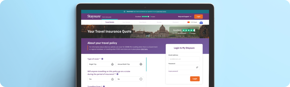
Quote & Buy Journey
A series of branded competition pages created in partnership between leading brands and Global’s radio stations, including Capital FM, Radio X, Smooth, Classic FM, and more. These campaigns combined brand messaging with the stations’ audiences to drive engagement, awareness, and participation.
I design and deliver premium co-branded digital experiences, creating high-impact single-page applications that bring campaigns to life across diverse audiences and platforms. My work combines bold visual storytelling, scalable design systems, and technical insight, ensuring each project is both creative and strategically effective. Through seamless collaboration and end-to-end ownership, I produce polished, on-brand experiences that consistently engage and inspire.

Client
Global
Role
Senior UX/ UI Designer
Team
3 Designers, 3 Developers and 1PM
Timeframe
Jan 2025 - Oc 2025
The Problem
The primary challenge was the pace of delivery. Each co-branded site had a very short turnaround, often just two to three days from brief to final design. This meant quickly understanding new brand guidelines, campaign objectives, and audience expectations, while still maintaining a high standard of creative and strategic thinking.
It was also demanding to context-switch between multiple briefs running in parallel. At times, this meant shifting focus to a new campaign before another was fully complete, requiring strong organisation, mental agility, and the ability to stay creatively consistent under pressure.
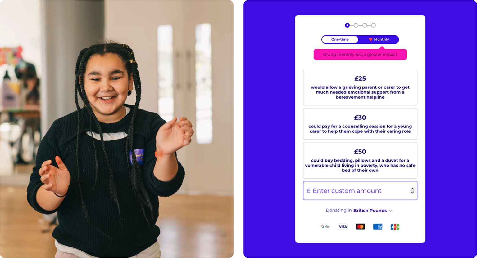
The previous visual identity lacked energy and warmth, relying heavily on dense copy and static layouts. The challenge was to evolve the design language into something more modern, vibrant, and emotionally engaging — without alienating existing supporters or losing brand recognition.
Balancing playfulness with credibility
Make Some Noise operates in a unique space: fun, music-led campaigns supporting deeply serious causes such as mental health, domestic abuse recovery, and family care. The redesign had to strike a careful balance — maintaining joy, optimism, and momentum, while treating the subject matter with sensitivity and respect.
Improving the donation journey
The original donation flow lacked urgency and emotional connection. I needed to simplify the journey, improve visual hierarchy, and use storytelling, colour, and clear calls to action to encourage users to move from awareness to action — without feeling pressured or overwhelmed.
Cross-team alignment
With input from editorial, radio, charity leads, and digital teams, aligning priorities and feedback was an ongoing challenge. This required clear communication, rapid iteration, and a flexible design approach that could accommodate different perspectives while protecting the integrity of the overall experience.
Understanding the problem
Highlights
I led a research and design process, supported by a talented team of POs, and developers while working remotely and in the London WeWork office. Our efforts led to the discovery of valuable user insights, numerous user experience improvements, and a validated long-term design direction for the future development.
- Modernising the journey, without making it harder for the user to understand
- What does the customer want to see, by understanding what the customer needs to see and stop asking unnecessary questions saves time and confusion.
- Creating Mobile First. Mobile consumption is going up every year while desktop is being used less. Designing mobile first makes it easier to understand the restrictions you have, and also making it easier to design desktop afterward rather then the other way around.
The Brief
The reason for this modernisation of the quote page is to bring up conversion, reduce drop off rate and drop call volume to the call centre. While doing this I’m also expecting the amount of sales to go up with a quicker time to the payment page. This is by taking out unnecessary questions to saves the user time and confusion.
Objectives
- Redesign the journey to help the user understand the flow of the journey.
- Bringing pages together and making a few steps as possible, while being compliant
- Role out a MVP Staysure product to get data and feedback to help know we are being the best in the industry.
- Create a UX/UI process, to help all featured teams help build the product.
The Process
Research & Discovery
Part of the UX role is to find problems to solve, this could be from looking at data to see where users are going wrong, to improving the conversion percentage.After finding a problem or being given a brief, I will look on sites such as Behance, ColletUI or Dribbble for inspiration or comparison with the industry.
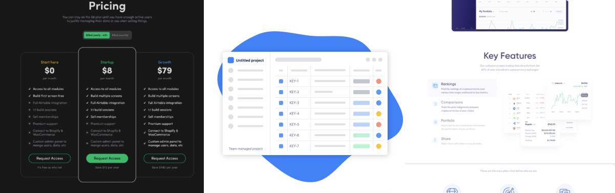
Workshops
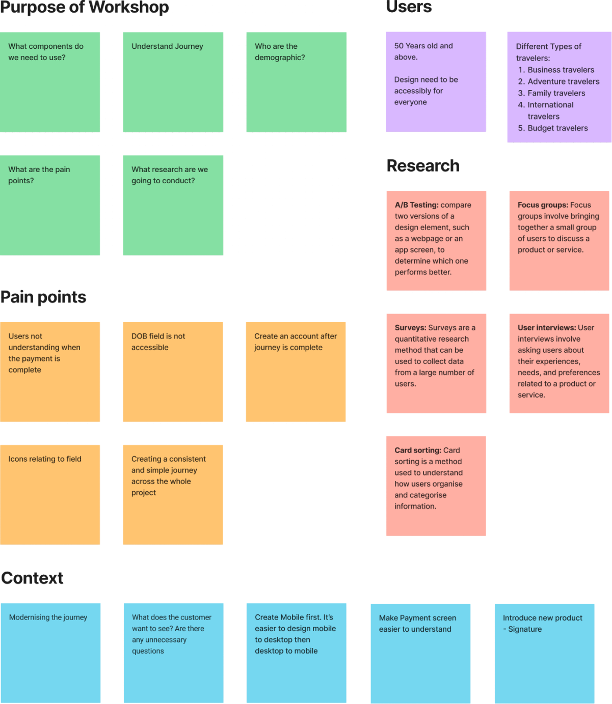
The workshop we did was a collaborative session where designers, stakeholders, and users come together to identify and solve problems related to user experience. Here are some things we did in our workshop:
- Define the purpose: Start by defining the purpose of the workshop, such as improving the usability of a product, identifying pain points.
- Define the Users: Identify who will participate in the workshop, including designers, developers, stakeholders, and users.
- Conduct user research: Use data from user interviews, surveys, and analytics to understand user needs, goals, and behaviour.
- Identify pain points: Identify pain points in the user journey, such as confusing navigation, slow page loading, or difficult checkout process.
- Generate ideas with wireframes: Use brainstorming techniques to generate ideas for improving the user experience. Encourage participants to think outside the box and come up with innovative solutions.
- Prioritise ideas: Use a voting system to prioritise the most important ideas. This helps to ensure that the most impactful changes are implemented first.
Overall, a UX workshop is a collaborative and iterative process that helps to improve the user experience of a product or service. By involving designers, developers, stakeholders, and users, you can create solutions that meet the needs of your target audience.
Concept & Wireframes
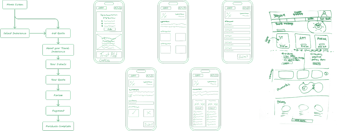
Once I have looked for inspiration or comparison, I will create high level concept art with necessary features to see how the prototype would work.
Wireframe ideas to get the best possible outcome for the product. This include mapping out the site and drawing up mockups. As we know all the components from the design system, this allows us to focus on what we want the customer to see and do.
The reason for this modernisation of the quote page is to bring up conversion, reduce drop off rate and drop call volume to the call centre. While doing this I’m also expecting the amount of sales to go up with a quicker time to the payment page. This is by taking out unnecessary questions to saves the user time and confusion.
Designs & Prototyping
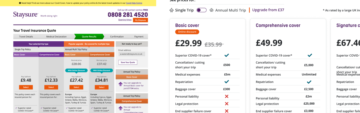
After I’m happy with my wireframes & concept art, I will create a polished design and prototype.
I’ll start by creating a low fidelity design to see if spacing works well and start on getting the correct copy. This is usually done in black and white or dark grey, so i can focus on the content and flow. This helps remove the complexity of the project.
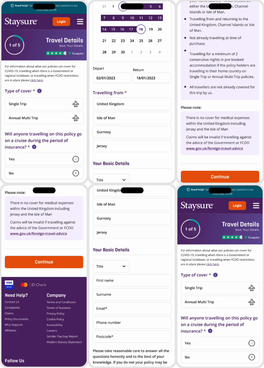
Once I’m happy with the low fidelity design, I’ll transition them into high fidelity. Turning everything in to the component from the style guide and work on prototyping to make sure the animations and flow of the designs work well together.
First Step
Strip down to the good and bad, and rebuild
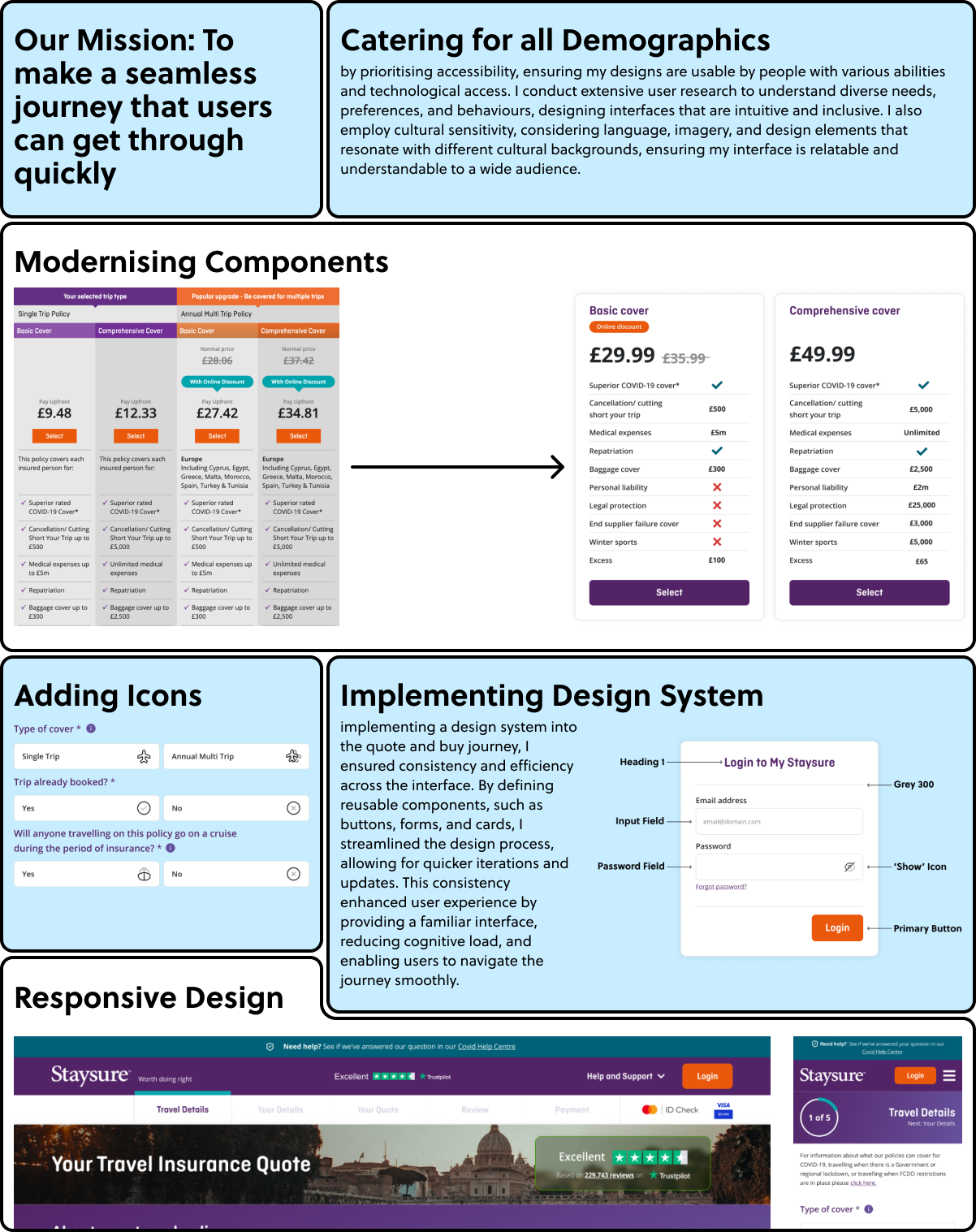
After my discovery and concept phase of the UX/UI process, I decided to look at all the components in the main style guide and take out the bad ones, and look at the good ones and see if they can be improved. I also knew that mobile first is a must, as our products is customer focused. This helps me build the new style guide, brand guidelines and component library.
Second Step
Listening to the customer
Understanding the theme of the site and iconography, was a massive process that will help me get in the mind of our users in the long term. This was by listening to calls in the contact centre and understanding why the customer is calling and how can i design the new page to avoid their struggles. Once I knew where the customer were going wrong, and how I could achieve a seamless journey that they could quickly get through (as no one wants to be buying travel Insurance all day).
Understanding Branding
Understanding the branding and consistently was very tricky to accomplish but was worth it in the end. This was done by creating all the components at one time, making sure they fit in the journey and are needed. Then Rinse and repeat until everything feel connected and nothing is out of place. The result of this makes the journey feel well crafted while making it easy for the user to understand what they need to do.
The Process
Every project starts with understanding the problem before designing a solution. I use the Double Diamond design process as a guide because it keeps the work focused on real user needs while ensuring the final product meets business goals.
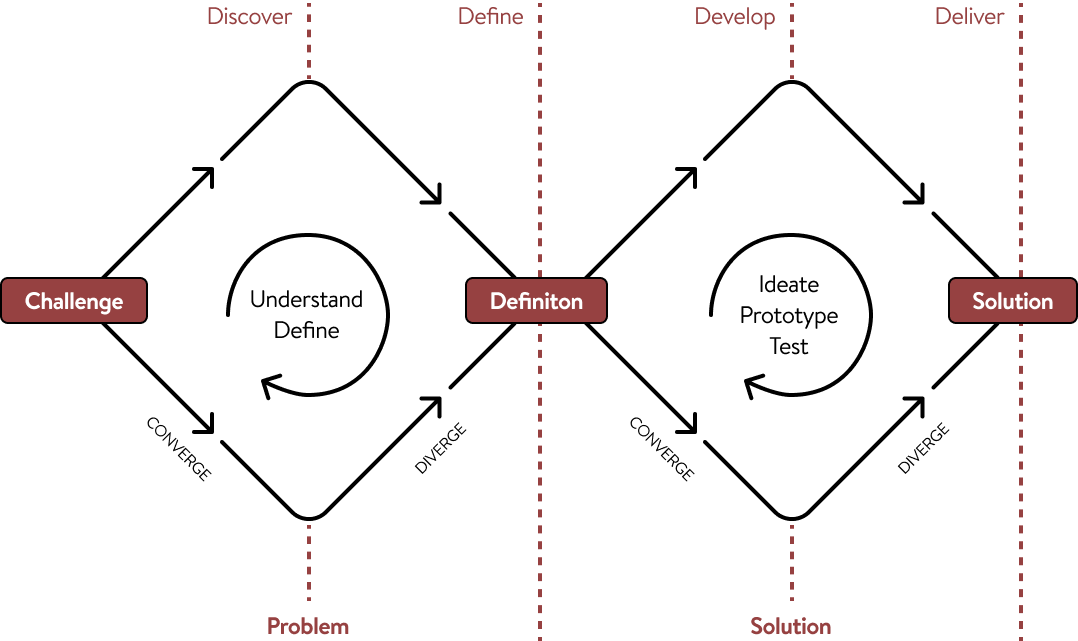
Discover (Understanding the Problem)
Before opening Figma, I take time to learn about the business, the users, and the challenges they're facing.
This might include:
- Learning about your business goals
- Understanding your target audience
- Reviewing existing products or websites
- Looking at competitors and industry trends
- Identifying pain points and opportunities
The goal is to build a clear picture of what needs to be solved—not just what needs to be designed.
Define (Creating a Clear Direction)
Once the research is complete, I organise the findings into a clear plan.
During this stage, I:
- Prioritise the biggest user and business needs
- Define project goals
- Map out user journeys
- Decide which features or pages will have the greatest impact
This creates a strong foundation before moving into design, helping avoid unnecessary revisions later.
Develop (Exploring Solutions)
With a clear direction in place, I begin designing and testing ideas.
This typically includes:
- Wireframes
- User flows
- Interface design
- Interactive prototypes
- Gathering feedback and refining the design
Rather than settling on the first idea, I explore different approaches to find the solution that works best for both users and the business.
Deliver (Building the Final Product)
The final stage is about turning the chosen solution into something ready to launch. This includes:
- High-fidelity UI designs
- Design systems and components
- Developer handoff
- Final quality checks
- Support during implementation when needed
The result is a polished, user-focused product that is designed to solve real problems, not just look good.
Why This Process Matters
Following a structured design process helps reduce guesswork, keeps projects aligned with business goals, and ensures every design decision has a purpose.
It also creates better communication throughout the project, giving clients visibility into each stage and confidence that we're solving the right problem before investing time in the final design.
Testing
There were many ways we tested the product was the best fit for our users and that the design meets user needs and expectations. These were:
A/B Testing
Our A/B Tests were for 2 reasons. 1: To see that it is the best for our customers. 2: If 1 was successful then we would sometime push the test to 100% so this wouldn’t demand the developers to code it properly in our production environment. Based on the results of the A/B test, the design team could make a decision on which version of the homepage to implement permanently. A/B testing can help UX designers make data-driven decisions about design elements and optimize a design for specific metrics, such as conversion rates or engagement.
Prototype VS Pre-Production
Most of the time, I will test the prototype i sent to the development team to the pre-production they have sent back to ensure that everything in my prototype is met in there version. The reason for this is so a prototype is a preliminary version of a product created to test and evaluate the design concept, while pre-production is the stage before mass production where the final product design is confirmed, and the production process is established. Prototyping is an iterative process that helps refine and improve the design, while pre-production is focused on ensuring that the product is manufactured at scale according to design specifications.
Heuristic evaluation
Here are the steps we conduct in our heuristic evaluation:
- Assemble a team of experts: Gather a team of experts who are familiar with usability principles and have experience with the type of product or service being evaluated.
- Choose a set of heuristics: Select a set of established usability principles or guidelines that will be used to evaluate the design. Examples of heuristics include Nielsen's 10 heuristics and Jakob Nielsen's usability guidelines.
- Evaluate the design: Each team member should evaluate the design independently, following the set of heuristics. They should take notes on any usability issues or potential areas for improvement.
- Compile the results: Compile the results of the evaluation into a single report or spreadsheet, listing each issue or potential improvement identified by the team.
- Prioritise the issues: Prioritise the issues based on severity, frequency, and impact on user experience. Identify the most critical issues that need to be addressed first.
- Address the issues: Based on the results of the evaluation, the design team should address the identified issues, either through design changes or additional user testing.
- Repeat the process: Conduct regular heuristic evaluations throughout the design process to ensure that the product or service meets usability standards and remains user-centred.
Heuristic evaluations can be conducted quickly and inexpensively, making them an excellent method for identifying potential usability issues early in the design process. However, it's important to keep in mind that heuristic evaluations are not a substitute for user testing, and additional user research should be conducted to validate and refine the design.
Analytics
The tool we mainly used in analytics is Google Analytics (GA), as it’s easy to setup with GA tags in the code.
Here how we used GA to test our product was the best fit for our customers:
- Understand user behaviour: GA provides insights into how users interact with your website, including which pages they visit, how long they stay on each page, and what actions they take. This information can help you optimise your website for user engagement and conversions.
- Measure website performance: GA tracks website performance metrics, such as page load time, bounce rate, and conversion rates. This data helps you identify areas for improvement and measure the impact of changes you make to your website.
- Identify traffic sources: GA provides information on the sources of traffic to your website, including search engines, social media, and referral sources. This information helps you identify which marketing channels are most effective and allocate resources accordingly.
- Monitor campaigns: GA allows you to track the performance of your marketing campaigns, including email marketing, social media ads, and pay-per-click advertising. This information helps you identify which campaigns are most effective and optimise your marketing efforts.
- Customisable reports: GA offers customisable reports and dashboards, so you can track the metrics that are most important to your business. You can also set up alerts to notify you of significant changes in website traffic or user behaviour.
Overall, GA provides valuable insights into website traffic and user behaviour, which can help you optimise your website, improve user experience, and make data-driven decisions about marketing and advertising.
9.6% decrease
in call rates
8%+ increase
in complete purchases
12% decrease
in drop off rates
Next Step
We go again!
Once we have got feedback from the customers, data and call centre, then I’ll have a better understanding of what went wrong (as no design is truly perfect) then work on making those fixes. While creating version 2, I would like to have a better understand of compliance to know what is not allowed and what can be bent to make a better user experience while staying within the rules. While the development team is working on building this, one of the requirements is also to add a better tagging system, so we can closely follow data.


Say Hello
I’m open for freelance and permanent role opportunities. Or simply say hello, if you like the site!
LinkedIn
me@alexwaters.co.ukSite designed and built by Alex Waters
©2026
Quote & Buy Journey
a seamless journey that users could quickly get through (as no one wants to be buying travel Insurance all day)
This project is to bring the Staysure Style Guide ⎋ to life and achieve a seamless journey that users could quickly get through (as no one wants to be buying travel Insurance all day). Our main two project that we knew needed to work with the style guide was the Quote/New Customer journey, and the MyAccount/ Self-Service page. This project is how I transformed the old style of the quote page to the new style.

Client
Global
Role
Senior UX/ UI Designer
Team
2 Designers, 3 Developers and 1PM
Timeframe
July 2025 - September 2025
The Problem
The primary challenge was the pace of delivery. Each co-branded site had a very short turnaround, often just two to three days from brief to final design. This meant quickly understanding new brand guidelines, campaign objectives, and audience expectations, while still maintaining a high standard of creative and strategic thinking.
Shifting user perception
It was also demanding to context-switch between multiple briefs running in parallel. At times, this meant shifting focus to a new campaign before another was fully complete, requiring strong organisation, mental agility, and the ability to stay creatively consistent under pressure.
The existing site positioned competitions as the primary interaction point, which risked overshadowing the charity’s core purpose. A key challenge was reframing Make Some Noise as a charity-first platform, while still preserving the excitement and accessibility that competitions bring. The experience needed to feel purpose-led without becoming overly serious or transactional.
Outdated and text-heavy experience
The previous visual identity lacked energy and warmth, relying heavily on dense copy and static layouts. The challenge was to evolve the design language into something more modern, vibrant, and emotionally engaging — without alienating existing supporters or losing brand recognition.
Balancing playfulness with credibility
Make Some Noise operates in a unique space: fun, music-led campaigns supporting deeply serious causes such as mental health, domestic abuse recovery, and family care. The redesign had to strike a careful balance — maintaining joy, optimism, and momentum, while treating the subject matter with sensitivity and respect.
Improving the donation journey
The original donation flow lacked urgency and emotional connection. I needed to simplify the journey, improve visual hierarchy, and use storytelling, colour, and clear calls to action to encourage users to move from awareness to action — without feeling pressured or overwhelmed.
Cross-team alignment
With input from editorial, radio, charity leads, and digital teams, aligning priorities and feedback was an ongoing challenge. This required clear communication, rapid iteration, and a flexible design approach that could accommodate different perspectives while protecting the integrity of the overall experience.
Understanding the problem
Highlights
I led a research and design process, supported by a talented team of POs, and developers while working remotely and in the London WeWork office. Our efforts led to the discovery of valuable user insights, numerous user experience improvements, and a validated long-term design direction for the future development.
- Modernising the journey, without making it harder for the user to understand
- What does the customer want to see, by understanding what the customer needs to see and stop asking unnecessary questions saves time and confusion.
- Creating Mobile First. Mobile consumption is going up every year while desktop is being used less. Designing mobile first makes it easier to understand the restrictions you have, and also making it easier to design desktop afterward rather then the other way around.
The Brief
The reason for this modernisation of the quote page is to bring up conversion, reduce drop off rate and drop call volume to the call centre. While doing this I’m also expecting the amount of sales to go up with a quicker time to the payment page. This is by taking out unnecessary questions to saves the user time and confusion.
Objectives
- Redesign the journey to help the user understand the flow of the journey.
- Bringing pages together and making a few steps as possible, while being compliant
- Role out a MVP Staysure product to get data and feedback to help know we are being the best in the industry.
- Create a UX/UI process, to help all featured teams help build the product.
The Process
Research & Discovery
Part of the UX role is to find problems to solve, this could be from looking at data to see where users are going wrong, to improving the conversion percentage.After finding a problem or being given a brief, I will look on sites such as Behance, ColletUI or Dribbble for inspiration or comparison with the industry.
Workshops
The workshop we did was a collaborative session where designers, stakeholders, and users come together to identify and solve problems related to user experience. Here are some things we did in our workshop:
- Define the purpose: Start by defining the purpose of the workshop, such as improving the usability of a product, identifying pain points.
- Define the Users: Identify who will participate in the workshop, including designers, developers, stakeholders, and users.
- Conduct user research: Use data from user interviews, surveys, and analytics to understand user needs, goals, and behaviour.
- Identify pain points: Identify pain points in the user journey, such as confusing navigation, slow page loading, or difficult checkout process.
- Generate ideas with wireframes: Use brainstorming techniques to generate ideas for improving the user experience. Encourage participants to think outside the box and come up with innovative solutions.
- Prioritise ideas: Use a voting system to prioritise the most important ideas. This helps to ensure that the most impactful changes are implemented first.
Overall, a UX workshop is a collaborative and iterative process that helps to improve the user experience of a product or service. By involving designers, developers, stakeholders, and users, you can create solutions that meet the needs of your target audience.
Concept & Wireframes
Once I have looked for inspiration or comparison, I will create high level concept art with necessary features to see how the prototype would work.
Wireframe ideas to get the best possible outcome for the product. This include mapping out the site and drawing up mockups. As we know all the components from the design system, this allows us to focus on what we want the customer to see and do.
The reason for this modernisation of the quote page is to bring up conversion, reduce drop off rate and drop call volume to the call centre. While doing this I’m also expecting the amount of sales to go up with a quicker time to the payment page. This is by taking out unnecessary questions to saves the user time and confusion.
Designs & Prototyping
After I’m happy with my wireframes & concept art, I will create a polished design and prototype.
I’ll start by creating a low fidelity design to see if spacing works well and start on getting the correct copy. This is usually done in black and white or dark grey, so i can focus on the content and flow. This helps remove the complexity of the project.
Once I’m happy with the low fidelity design, I’ll transition them into high fidelity. Turning everything in to the component from the style guide and work on prototyping to make sure the animations and flow of the designs work well together.
First Step
Strip down to the good and bad, and rebuild
After my discovery and concept phase of the UX/UI process, I decided to look at all the components in the main style guide and take out the bad ones, and look at the good ones and see if they can be improved. I also knew that mobile first is a must, as our products is customer focused. This helps me build the new style guide, brand guidelines and component library.
Second Step
Listening to the customer
Understanding the theme of the site and iconography, was a massive process that will help me get in the mind of our users in the long term. This was by listening to calls in the contact centre and understanding why the customer is calling and how can i design the new page to avoid their struggles. Once I knew where the customer were going wrong, and how I could achieve a seamless journey that they could quickly get through (as no one wants to be buying travel Insurance all day).
Understanding Branding
Understanding the branding and consistently was very tricky to accomplish but was worth it in the end. This was done by creating all the components at one time, making sure they fit in the journey and are needed. Then Rinse and repeat until everything feel connected and nothing is out of place. The result of this makes the journey feel well crafted while making it easy for the user to understand what they need to do.
The Process
Every project starts with understanding the problem before designing a solution. I use the Double Diamond design process as a guide because it keeps the work focused on real user needs while ensuring the final product meets business goals.
Discover (Understanding the Problem)
Before opening Figma, I take time to learn about the business, the users, and the challenges they're facing.
This might include:
- Learning about your business goals
- Understanding your target audience
- Reviewing existing products or websites
- Looking at competitors and industry trends
- Identifying pain points and opportunities
The goal is to build a clear picture of what needs to be solved—not just what needs to be designed.
Define (Creating a Clear Direction)
Once the research is complete, I organise the findings into a clear plan.
During this stage, I:
- Prioritise the biggest user and business needs
- Define project goals
- Map out user journeys
- Decide which features or pages will have the greatest impact
This creates a strong foundation before moving into design, helping avoid unnecessary revisions later.
Develop (Exploring Solutions)
With a clear direction in place, I begin designing and testing ideas.
This typically includes:
- Wireframes
- User flows
- Interface design
- Interactive prototypes
- Gathering feedback and refining the design
Rather than settling on the first idea, I explore different approaches to find the solution that works best for both users and the business.
Deliver (Building the Final Product)
The final stage is about turning the chosen solution into something ready to launch. This includes:
- High-fidelity UI designs
- Design systems and components
- Developer handoff
- Final quality checks
- Support during implementation when needed
The result is a polished, user-focused product that is designed to solve real problems, not just look good.
Why This Process Matters
Following a structured design process helps reduce guesswork, keeps projects aligned with business goals, and ensures every design decision has a purpose.
It also creates better communication throughout the project, giving clients visibility into each stage and confidence that we're solving the right problem before investing time in the final design.
Testing
There were many ways we tested the product was the best fit for our users and that the design meets user needs and expectations. These were:
A/B Testing
Our A/B Tests were for 2 reasons. 1: To see that it is the best for our customers. 2: If 1 was successful then we would sometime push the test to 100% so this wouldn’t demand the developers to code it properly in our production environment. Based on the results of the A/B test, the design team could make a decision on which version of the homepage to implement permanently. A/B testing can help UX designers make data-driven decisions about design elements and optimize a design for specific metrics, such as conversion rates or engagement.
Prototype VS Pre-Production
Most of the time, I will test the prototype i sent to the development team to the pre-production they have sent back to ensure that everything in my prototype is met in there version. The reason for this is so a prototype is a preliminary version of a product created to test and evaluate the design concept, while pre-production is the stage before mass production where the final product design is confirmed, and the production process is established. Prototyping is an iterative process that helps refine and improve the design, while pre-production is focused on ensuring that the product is manufactured at scale according to design specifications.
Heuristic evaluation
Here are the steps we conduct in our heuristic evaluation:
- Assemble a team of experts: Gather a team of experts who are familiar with usability principles and have experience with the type of product or service being evaluated.
- Choose a set of heuristics: Select a set of established usability principles or guidelines that will be used to evaluate the design. Examples of heuristics include Nielsen's 10 heuristics and Jakob Nielsen's usability guidelines.
- Evaluate the design: Each team member should evaluate the design independently, following the set of heuristics. They should take notes on any usability issues or potential areas for improvement.
- Compile the results: Compile the results of the evaluation into a single report or spreadsheet, listing each issue or potential improvement identified by the team.
- Prioritise the issues: Prioritise the issues based on severity, frequency, and impact on user experience. Identify the most critical issues that need to be addressed first.
- Address the issues: Based on the results of the evaluation, the design team should address the identified issues, either through design changes or additional user testing.
- Repeat the process: Conduct regular heuristic evaluations throughout the design process to ensure that the product or service meets usability standards and remains user-centred.
Heuristic evaluations can be conducted quickly and inexpensively, making them an excellent method for identifying potential usability issues early in the design process. However, it's important to keep in mind that heuristic evaluations are not a substitute for user testing, and additional user research should be conducted to validate and refine the design.
Analytics
The tool we mainly used in analytics is Google Analytics (GA), as it’s easy to setup with GA tags in the code.
Here how we used GA to test our product was the best fit for our customers:
- Understand user behaviour: GA provides insights into how users interact with your website, including which pages they visit, how long they stay on each page, and what actions they take. This information can help you optimise your website for user engagement and conversions.
- Measure website performance: GA tracks website performance metrics, such as page load time, bounce rate, and conversion rates. This data helps you identify areas for improvement and measure the impact of changes you make to your website.
- Identify traffic sources: GA provides information on the sources of traffic to your website, including search engines, social media, and referral sources. This information helps you identify which marketing channels are most effective and allocate resources accordingly.
- Monitor campaigns: GA allows you to track the performance of your marketing campaigns, including email marketing, social media ads, and pay-per-click advertising. This information helps you identify which campaigns are most effective and optimise your marketing efforts.
- Customisable reports: GA offers customisable reports and dashboards, so you can track the metrics that are most important to your business. You can also set up alerts to notify you of significant changes in website traffic or user behaviour.
Overall, GA provides valuable insights into website traffic and user behaviour, which can help you optimise your website, improve user experience, and make data-driven decisions about marketing and advertising.
9.6% decrease
in call rates
8%+ increase
in complete purchases
12% decrease
in drop off rates
Next Steps
We go again!
Once we have got feedback from the customers, data and call centre, then I’ll have a better understanding of what went wrong (as no design is truly perfect) then work on making those fixes. While creating version 2, I would like to have a better understand of compliance to know what is not allowed and what can be bent to make a better user experience while staying within the rules. While the development team is working on building this, one of the requirements is also to add a better tagging system, so we can closely follow data.

Site designed and built by Alex Waters
©2026
Say Hello
I’m open for freelance and permanent role opportunities. Or simply say hello, if you like the site!
LinkedIn
me@alexwaters.co.uk