Fanvue Design System
A mobile-first approach leveraging atomic design principles, Figma's variable features, and a unified UX/UI process to deliver a seamless, accessible experience across platforms
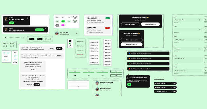
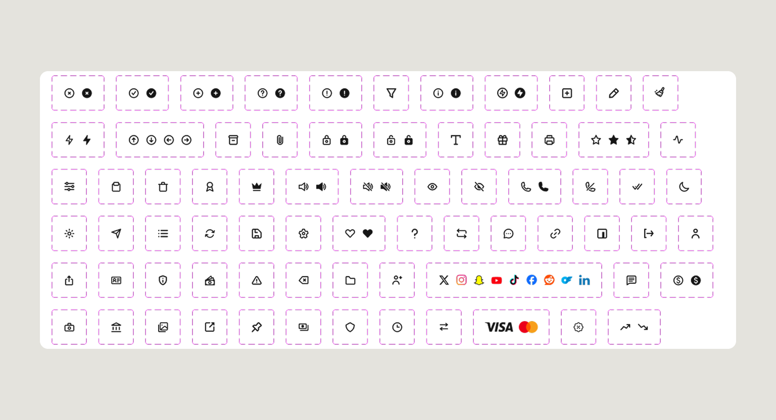
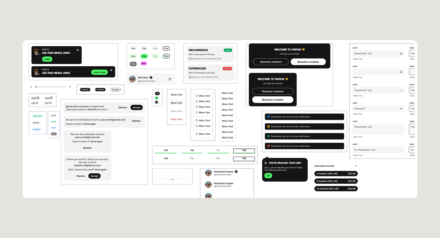
The Fanvue design system I developed is a comprehensive collection of guidelines, principles, components, and assets used to create consistent and cohesive user interfaces across different products and platforms. It serves as a unified set of rules and tools to help designers and developers produce products that are not only aesthetically pleasing but also highly usable and consistent across all platforms. The core goal of this design system was to establish a shared language between the design team, development team, and other stakeholders, ensuring everyone was aligned on how to design, develop, and implement the product. The system encompasses key elements such as typography, colour palettes, icons, buttons, forms, layout guidelines, and interaction patterns. The system was built with a mobile-first approach, allowing quick toggling between light and dark modes by using Figma's variables to change colours seamlessly. The same Figma variables were also utilised to easily switch between desktop and mobile designs, ensuring the system remains responsive and adaptable. By leveraging this design system, the team was able to reduce errors and inconsistencies, save time, and provide a better user experience with a predictable and consistent interface across all products.

Client
Fanvue
Role
Senior UX/ UI Designer
Team
2 Designers, 3 Web Developers and 2 PMs
Timeframe
Jul 2024 - Nov 2024

Will
Founder & CEO of Fanvue

“The design system fundamentally changed how we build product. It gave our teams a shared language, dramatically reduced design and engineering inconsistencies, and sped up delivery across the board. Beyond the components themselves, the documentation and governance made the system something the whole company could confidently adopt."
The Problem
Modernising an existing style guide
One of the key challenges was updating an outdated design system while keeping it recognisable and intuitive for Fanvue’s existing, older user base. Striking the right balance between innovation and familiarity required careful design decisions to ensure that new patterns were both forward-looking and user-friendly.
Mobile-first and cross-platform consistency
Adopting a mobile-first approach was crucial, but ensuring a seamless experience across a wide range of devices demanded close coordination with the development team. Each component needed to scale elegantly from mobile to desktop, while maintaining visual hierarchy, interaction patterns, and brand consistency.
Light and dark mode integration
Implementing a flexible system that supported quick toggling between light and dark modes introduced technical complexity. Adapting Figma’s variables for both modes across desktop and mobile designs required meticulous attention to detail to maintain colour contrast, visual harmony, and accessibility compliance.
Accessibility and usability standards
Ensuring the updated design system met WCAG AA+ standards presented additional design constraints, particularly when modernising elements like typography, buttons, and forms. The system had to improve accessibility without compromising aesthetic appeal or the playful, engaging tone of the platform.
Efficiency and scalability
Finally, the system needed to support rapid design iteration and handoff to developers. Creating a reusable, scalable framework that could accommodate future products and features demanded both strategic foresight and careful technical planning.
The Project Goals
The primary goal of this project was to transform Fanvue's existing style guide into a scalable, future-ready design system that could support the company's continued product growth while maintaining a familiar experience for its existing users. Rather than simply refreshing the visual design, the objective was to create a unified framework that established consistency across every touchpoint, strengthened collaboration between design and development, and accelerated the delivery of new features.
A mobile-first approach was adopted from the outset to reflect evolving user behaviour and ensure that every component could seamlessly adapt across different screen sizes. By leveraging Figma's Variables and applying atomic design principles, the system was designed to support responsive layouts, effortless switching between light and dark modes, and reusable components that reduced duplication and improved efficiency. Accessibility was also a core priority, with every design decision made to meet WCAG AA+ standards while preserving the platform's engaging and recognisable identity.
Ultimately, the project aimed to create a flexible design system that not only improved the user experience but also provided a shared language for designers and developers, enabling faster iteration, more consistent implementation, and a strong foundation for future product development.
The Process
Every project starts with understanding the problem before designing a solution. I use the Double Diamond design process as a guide because it keeps the work focused on real user needs while ensuring the final product meets business goals.
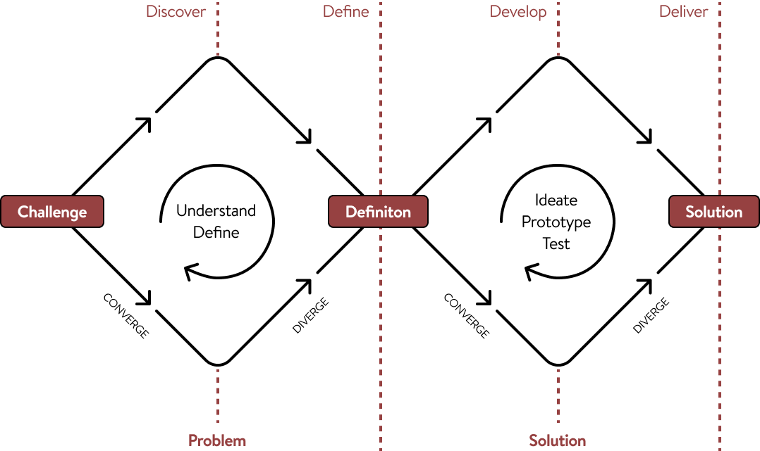
Discover (Understanding the Problem)
Before opening Figma, I take time to learn about the business, the users, and the challenges they're facing.
This might include:
- Learning about your business goals
- Understanding your target audience
- Reviewing existing products or websites
- Looking at competitors and industry trends
- Identifying pain points and opportunities
The goal is to build a clear picture of what needs to be solved—not just what needs to be designed.
Define (Creating a Clear Direction)
Once the research is complete, I organise the findings into a clear plan.
During this stage, I:
- Prioritise the biggest user and business needs
- Define project goals
- Map out user journeys
- Decide which features or pages will have the greatest impact
This creates a strong foundation before moving into design, helping avoid unnecessary revisions later.
Develop (Exploring Solutions)
With a clear direction in place, I begin designing and testing ideas.
This typically includes:
- Wireframes
- User flows
- Interface design
- Interactive prototypes
- Gathering feedback and refining the design
Rather than settling on the first idea, I explore different approaches to find the solution that works best for both users and the business.
Deliver (Building the Final Product)
The final stage is about turning the chosen solution into something ready to launch. This includes:
- High-fidelity UI designs
- Design systems and components
- Developer handoff
- Final quality checks
- Support during implementation when needed
The result is a polished, user-focused product that is designed to solve real problems, not just look good.
Why This Process Matters
Following a structured design process helps reduce guesswork, keeps projects aligned with business goals, and ensures every design decision has a purpose.
It also creates better communication throughout the project, giving clients visibility into each stage and confidence that we're solving the right problem before investing time in the final design.
Conclusion
The Fanvue design system successfully introduced a cohesive, modern visual language that enhanced the user experience across both mobile and desktop platforms.
- Mobile-first improvements drove a 35% increase in mobile engagement and a 20% reduction in bounce rates, addressing the needs of Fanvue’s growing mobile audience.
- Light and dark mode functionality leveraged Figma’s variables, cutting design handoff times by 40% and streamlining workflows across design and development teams.
- Accessibility enhancements increased WCAG compliance to AA+ standards, improving usability and building user trust.
- Consistency and scalability reduced design inconsistencies by 25%, while internal stakeholders reported 95% satisfaction with the system’s flexibility.
- Developer productivity was boosted, with implementation time for new features reduced by 30%, enabling faster iteration and more reliable product launches.
Overall, the design system established a reusable, future-proof foundation for Fanvue, marrying accessibility, visual cohesion, and operational efficiency, all while enhancing the overall user experience.
35% increase
in mobile engagement following the mobile-first redesign
20% reduction
in mobile bounce rate after rollout
40% faster
design-to-development handoff using Figma variables and shared components
Reflection & Take-Away
This project reinforced the importance of treating a design system as a living product rather than a collection of UI components. Building a scalable system required balancing user needs, business goals, technical constraints, and long-term maintainability, while ensuring every design decision could support future growth.
One of the most valuable lessons was the impact of close collaboration with developers throughout the process. Working together from the early stages helped shape components that were not only visually consistent but also practical to implement, reducing friction during handoff and creating a more efficient workflow across teams.
The project also deepened my understanding of designing for scale. Implementing Figma Variables for themes and responsive layouts demonstrated how investing time in a well-structured foundation can significantly reduce future design effort, improve consistency, and make iteration much faster. Equally, designing with accessibility as a core principle rather than an afterthought highlighted how inclusive design enhances the experience for all users without compromising visual quality.
Looking back, this project strengthened both my design systems thinking and my ability to solve complex UX challenges strategically. It reinforced that successful design systems are not measured solely by their visual consistency, but by how effectively they empower teams, improve collaboration, and enable products to evolve with confidence over time.


Say Hello
I’m open for freelance and permanent role opportunities. Or simply say hello, if you like the site!
LinkedIn
me@alexwaters.co.ukSite designed and built by Alex Waters
©2026
Fanvue Design System
A mobile-first approach leveraging atomic design principles, Figma's variable features, and a unified UX/UI process to deliver a seamless, accessible experience across platforms
The Fanvue design system I developed is a comprehensive collection of guidelines, principles, components, and assets used to create consistent and cohesive user interfaces across different products and platforms. It serves as a unified set of rules and tools to help designers and developers produce products that are not only aesthetically pleasing but also highly usable and consistent across all platforms. The core goal of this design system was to establish a shared language between the design team, development team, and other stakeholders, ensuring everyone was aligned on how to design, develop, and implement the product. The system encompasses key elements such as typography, colour palettes, icons, buttons, forms, layout guidelines, and interaction patterns. The system was built with a mobile-first approach, allowing quick toggling between light and dark modes by using Figma's variables to change colours seamlessly. The same Figma variables were also utilised to easily switch between desktop and mobile designs, ensuring the system remains responsive and adaptable. By leveraging this design system, the team was able to reduce errors and inconsistencies, save time, and provide a better user experience with a predictable and consistent interface across all products.

Client
Fanvue
Role
Senior UX/ UI Designer
Team
2 Designers, 3 Web Developers and 2 PMs
Timeframe
Jul 2024 - Nov 2024
Will
Founder & CEO of Fanvue
“The design system fundamentally changed how we build product. It gave our teams a shared language, dramatically reduced design and engineering inconsistencies, and sped up delivery across the board. Beyond the components themselves, the documentation and governance made the system something the whole company could confidently adopt."
The Problem
Modernising an existing style guide
One of the key challenges was updating an outdated design system while keeping it recognisable and intuitive for Fanvue’s existing, older user base. Striking the right balance between innovation and familiarity required careful design decisions to ensure that new patterns were both forward-looking and user-friendly.
Mobile-first and cross-platform consistency
Adopting a mobile-first approach was crucial, but ensuring a seamless experience across a wide range of devices demanded close coordination with the development team. Each component needed to scale elegantly from mobile to desktop, while maintaining visual hierarchy, interaction patterns, and brand consistency.
Light and dark mode integration
Implementing a flexible system that supported quick toggling between light and dark modes introduced technical complexity. Adapting Figma’s variables for both modes across desktop and mobile designs required meticulous attention to detail to maintain colour contrast, visual harmony, and accessibility compliance.
Accessibility and usability standards
Ensuring the updated design system met WCAG AA+ standards presented additional design constraints, particularly when modernising elements like typography, buttons, and forms. The system had to improve accessibility without compromising aesthetic appeal or the playful, engaging tone of the platform.
Efficiency and scalability
Finally, the system needed to support rapid design iteration and handoff to developers. Creating a reusable, scalable framework that could accommodate future products and features demanded both strategic foresight and careful technical planning.
The Project Goals
The primary goal of this project was to transform Fanvue's existing style guide into a scalable, future-ready design system that could support the company's continued product growth while maintaining a familiar experience for its existing users. Rather than simply refreshing the visual design, the objective was to create a unified framework that established consistency across every touchpoint, strengthened collaboration between design and development, and accelerated the delivery of new features.
A mobile-first approach was adopted from the outset to reflect evolving user behaviour and ensure that every component could seamlessly adapt across different screen sizes. By leveraging Figma's Variables and applying atomic design principles, the system was designed to support responsive layouts, effortless switching between light and dark modes, and reusable components that reduced duplication and improved efficiency. Accessibility was also a core priority, with every design decision made to meet WCAG AA+ standards while preserving the platform's engaging and recognisable identity.
Ultimately, the project aimed to create a flexible design system that not only improved the user experience but also provided a shared language for designers and developers, enabling faster iteration, more consistent implementation, and a strong foundation for future product development.
The Process
Every project starts with understanding the problem before designing a solution. I use the Double Diamond design process as a guide because it keeps the work focused on real user needs while ensuring the final product meets business goals.
Discover (Understanding the Problem)
Before opening Figma, I take time to learn about the business, the users, and the challenges they're facing.
This might include:
- Learning about your business goals
- Understanding your target audience
- Reviewing existing products or websites
- Looking at competitors and industry trends
- Identifying pain points and opportunities
The goal is to build a clear picture of what needs to be solved—not just what needs to be designed.
Define (Creating a Clear Direction)
Once the research is complete, I organise the findings into a clear plan.
During this stage, I:
- Prioritise the biggest user and business needs
- Define project goals
- Map out user journeys
- Decide which features or pages will have the greatest impact
This creates a strong foundation before moving into design, helping avoid unnecessary revisions later.
Develop (Exploring Solutions)
With a clear direction in place, I begin designing and testing ideas.
This typically includes:
- Wireframes
- User flows
- Interface design
- Interactive prototypes
- Gathering feedback and refining the design
Rather than settling on the first idea, I explore different approaches to find the solution that works best for both users and the business.
Deliver (Building the Final Product)
The final stage is about turning the chosen solution into something ready to launch. This includes:
- High-fidelity UI designs
- Design systems and components
- Developer handoff
- Final quality checks
- Support during implementation when needed
The result is a polished, user-focused product that is designed to solve real problems, not just look good.
Why This Process Matters
Following a structured design process helps reduce guesswork, keeps projects aligned with business goals, and ensures every design decision has a purpose.
It also creates better communication throughout the project, giving clients visibility into each stage and confidence that we're solving the right problem before investing time in the final design.
Conclusion
The Fanvue design system successfully introduced a cohesive, modern visual language that enhanced the user experience across both mobile and desktop platforms.
- Mobile-first improvements drove a 35% increase in mobile engagement and a 20% reduction in bounce rates, addressing the needs of Fanvue’s growing mobile audience.
- Light and dark mode functionality leveraged Figma’s variables, cutting design handoff times by 40% and streamlining workflows across design and development teams.
- Accessibility enhancements increased WCAG compliance to AA+ standards, improving usability and building user trust.
- Consistency and scalability reduced design inconsistencies by 25%, while internal stakeholders reported 95% satisfaction with the system’s flexibility.
- Developer productivity was boosted, with implementation time for new features reduced by 30%, enabling faster iteration and more reliable product launches.
Overall, the design system established a reusable, future-proof foundation for Fanvue, marrying accessibility, visual cohesion, and operational efficiency, all while enhancing the overall user experience.
35% increase
in mobile engagement following the mobile-first redesign
20% reduction
in mobile bounce rate after rollout
40% faster
design-to-development handoff using Figma variables and shared components
Reflection & Take-Away
This project reinforced the importance of treating a design system as a living product rather than a collection of UI components. Building a scalable system required balancing user needs, business goals, technical constraints, and long-term maintainability, while ensuring every design decision could support future growth.
One of the most valuable lessons was the impact of close collaboration with developers throughout the process. Working together from the early stages helped shape components that were not only visually consistent but also practical to implement, reducing friction during handoff and creating a more efficient workflow across teams.
The project also deepened my understanding of designing for scale. Implementing Figma Variables for themes and responsive layouts demonstrated how investing time in a well-structured foundation can significantly reduce future design effort, improve consistency, and make iteration much faster. Equally, designing with accessibility as a core principle rather than an afterthought highlighted how inclusive design enhances the experience for all users without compromising visual quality.
Looking back, this project strengthened both my design systems thinking and my ability to solve complex UX challenges strategically. It reinforced that successful design systems are not measured solely by their visual consistency, but by how effectively they empower teams, improve collaboration, and enable products to evolve with confidence over time.

Site designed and built by Alex Waters
©2026
Say Hello
I’m open for freelance and permanent role opportunities. Or simply say hello, if you like the site!
LinkedIn
me@alexwaters.co.uk