Journey Jolt (Case Study)
Have you ever tried to take a short nap on the train only to wake up and find yourself at the end of the line? How can you help passengers wake up just before the train arrives at their station?
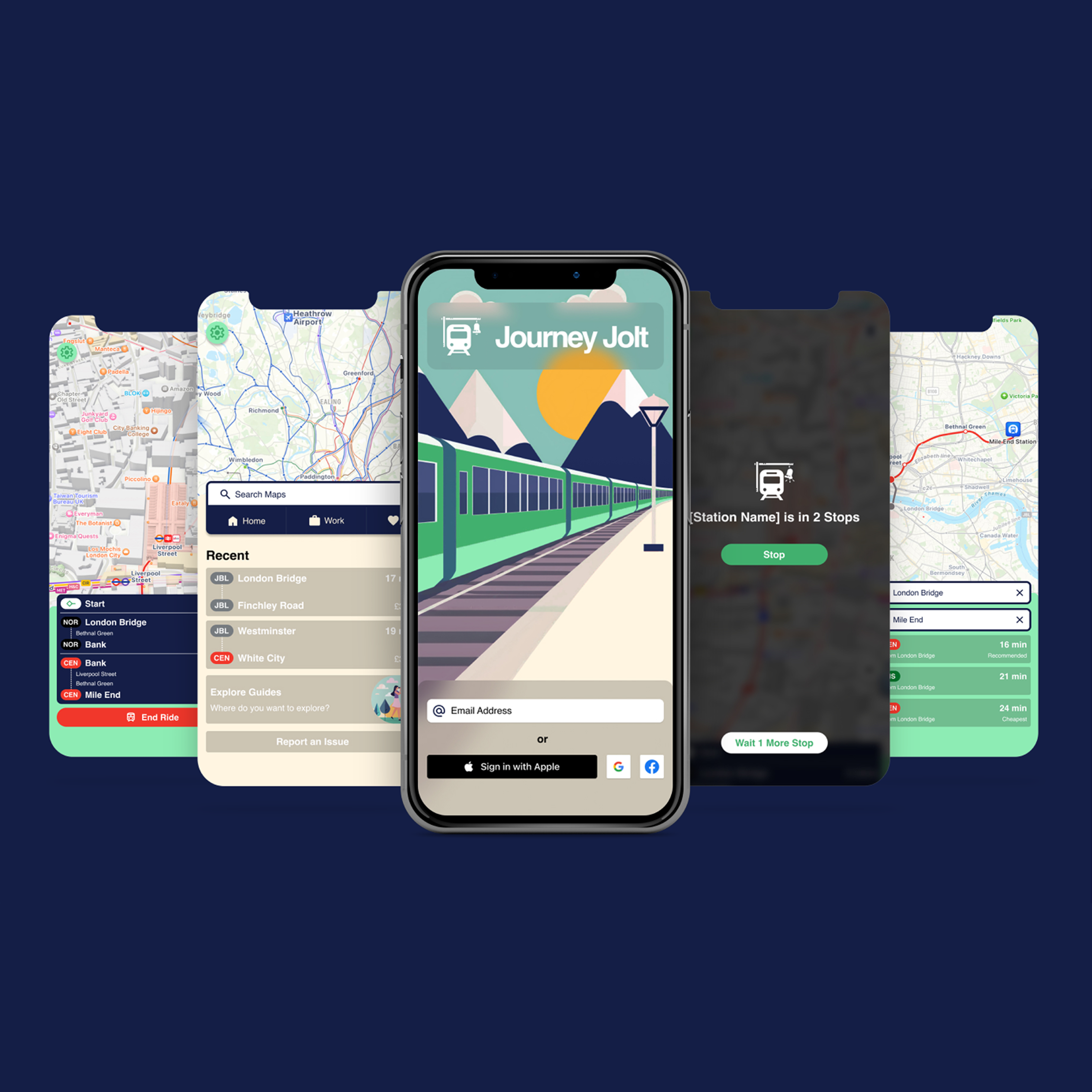
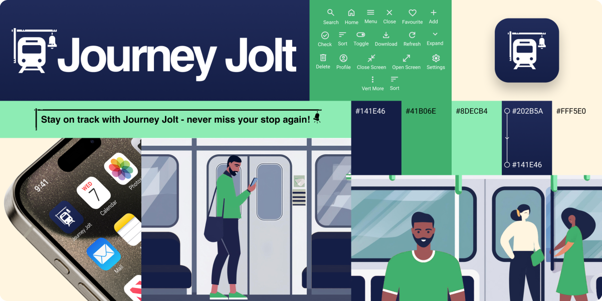
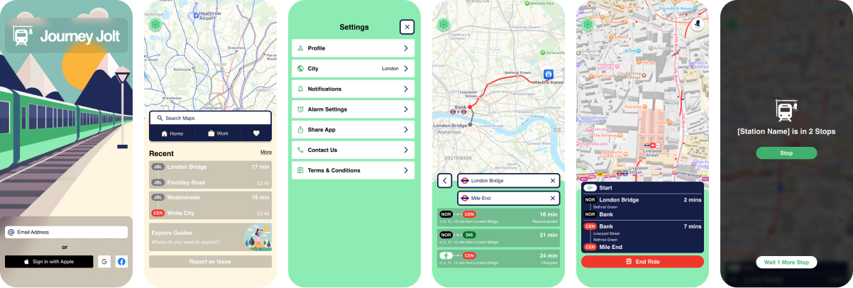
Our train app, named Journey Jolt, is designed to revolutionise the commuting experience by eliminating the anxiety of missing your stop. With the help of advanced GPS technology, the app tracks the user's train journey in real-time and sends timely alerts just before they reach their destination. Journey Jolt offers a seamless and stress-free experience, allowing passengers to relax, read, or even catch up on sleep during their commute. The app's user interface is intuitive and customisable, allowing users to set preferences for alerts, adjust notification settings, and save frequently traveled routes for convenience. Available on both iOS and Android platforms, WakeMeTrain aims to enhance the daily commute for millions of traveler's worldwide.
The Problem
The problems that we may come across while making Journey Jolt is:
- User Preferences: Making it easy for users to choose how they want to be notified.
- Battery Drain: Ensuring the app doesn't use too much battery power.
- Internet Issues: Dealing with times when the internet isn't guaranteed at all times.
- Testing on Different Devices: Confirming the app works well on all kinds of phones and tablets.
- Privacy and Security: Keeping user data safe and private.
- Helping Users Understand: Assuring users know how to use the app.
- Working with Train Systems: Double-checking to ensure the app can connect with different train systems. Especially with major cities that have underground train networks but also train networks that aren't that well known.
User Research
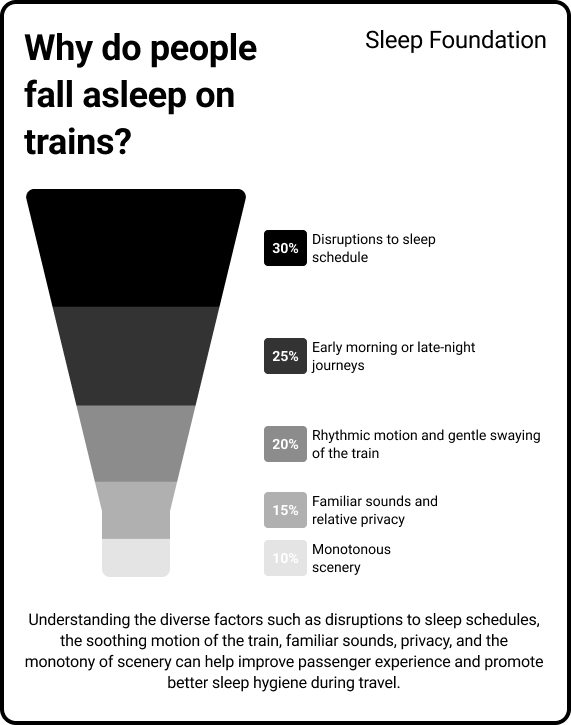
Passengers often find themselves nodding off while travelling on trains due to a combination of factors affecting their circadian rhythm and environment. According to the Sleep Foundation, disruptions to one's normal sleep schedule, known as circadian rhythm, can be a key factor. Research indicates that around 20% of adults get less than 6 hours of sleep on weeknights, which can contribute to increased drowsiness during travel. Travelling by train often involves early morning or late-night journeys, which can interfere with the body's natural sleep-wake cycle. A study by the UK's Office of Rail and Road found that over 40% of passengers use trains for commuting, with many of these journeys occurring during peak sleep times. Additionally, the rhythmic motion and gentle swaying of the train, as discussed in Elle, create a soothing environment conducive to relaxation and sleep. This motion mimics the sensation of being rocked to sleep, triggering a sense of calmness and comfort. Furthermore, the familiar sounds of the train and the relative privacy of one's seat contribute to a feeling of safety and security, further encouraging passengers to drift off. Combined with the often monotonous scenery passing by, the train carriage becomes an ideal setting for a quick nap, especially for tired commuters or travellers. Sourced from the Sleep Foundation
Competition Analysis
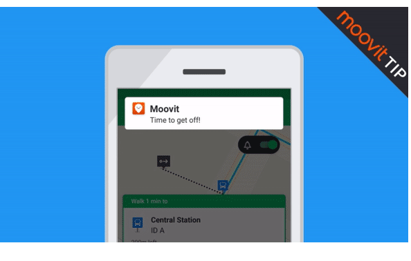
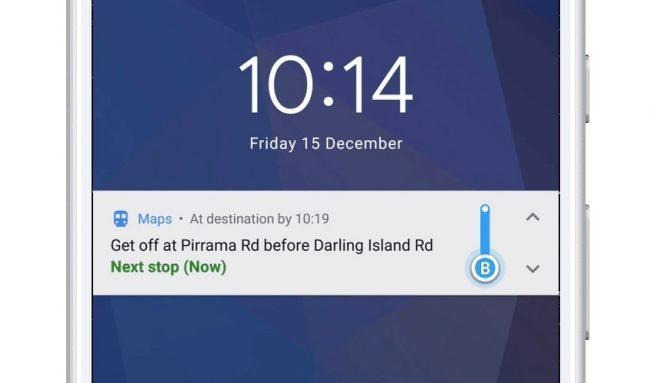
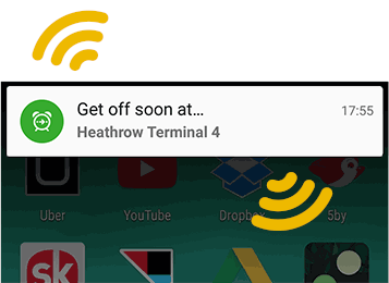
Over the 6 most popular apps for train travel, over half of them have the option to notify the user when the train is coming to their destination. Here is my findings.
Google Maps, Apple Maps, Moovit, & Citymapper: Has “Get off” Alert
Transit, Rail Planner, & Trainline: Doesn’t have alerts/ Notification for when the users station is coming up.
From theses finding, it shows that there is a gap in the market for a train application that alarms the users when they are coming up to their destination, as the most popular applications only notify the user. The worry for some notifications is that the user won’t hear them (and not wake them up) or some people have their phone on silent so this notification won’t be seen until they have woken up at the end of the line.
Define Stage
Workshop
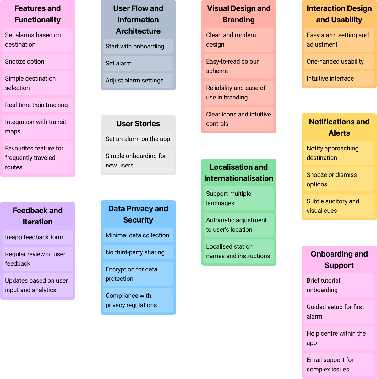
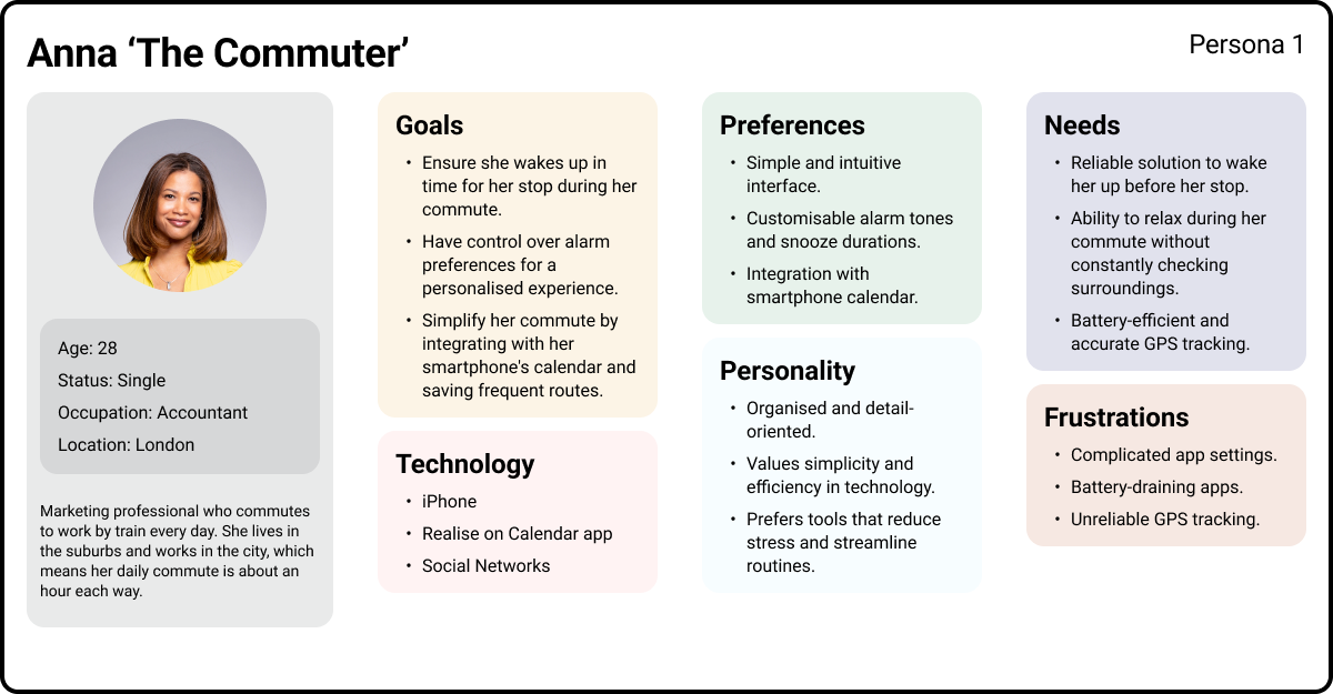
User Personas
The Challenges
Modernising an existing style guide
One of the key challenges was updating an outdated design system while keeping it recognisable and intuitive for Fanvue’s existing, older user base. Striking the right balance between innovation and familiarity required careful design decisions to ensure that new patterns were both forward-looking and user-friendly.
Mobile-first and cross-platform consistency
Adopting a mobile-first approach was crucial, but ensuring a seamless experience across a wide range of devices demanded close coordination with the development team. Each component needed to scale elegantly from mobile to desktop, while maintaining visual hierarchy, interaction patterns, and brand consistency.
Light and dark mode integration
Implementing a flexible system that supported quick toggling between light and dark modes introduced technical complexity. Adapting Figma’s variables for both modes across desktop and mobile designs required meticulous attention to detail to maintain colour contrast, visual harmony, and accessibility compliance.
Accessibility and usability standards
Ensuring the updated design system met WCAG AA+ standards presented additional design constraints, particularly when modernising elements like typography, buttons, and forms. The system had to improve accessibility without compromising aesthetic appeal or the playful, engaging tone of the platform.
Efficiency and scalability
Finally, the system needed to support rapid design iteration and handoff to developers. Creating a reusable, scalable framework that could accommodate future products and features demanded both strategic foresight and careful technical planning.
Initial Ideas
Research
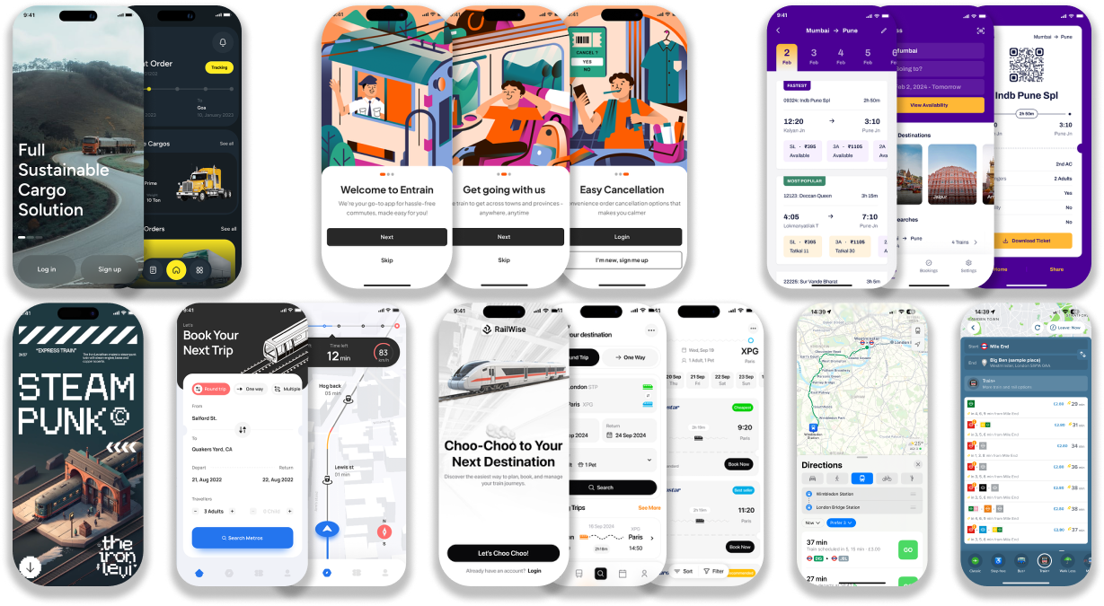
Brand and Experience Requirements
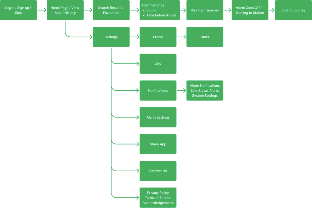
Flow Map
Design
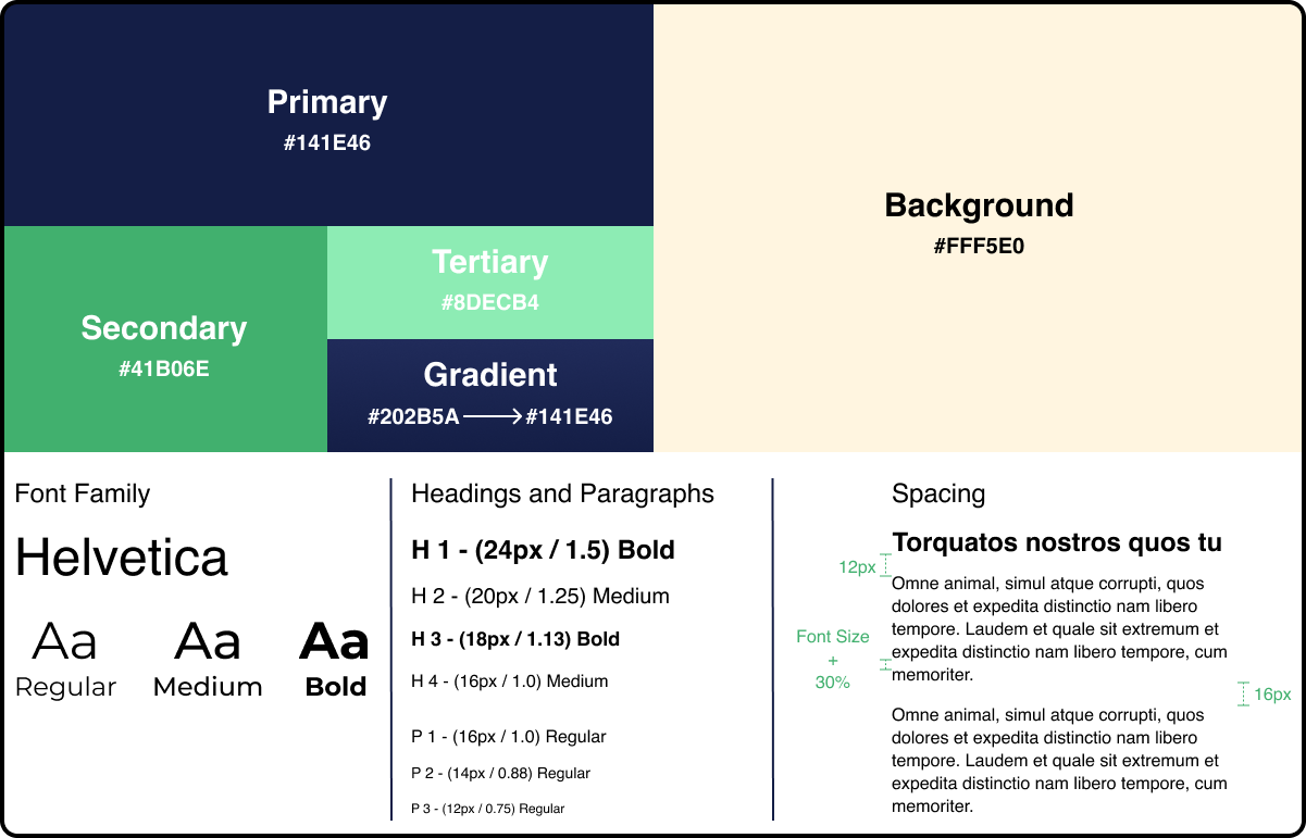
Colour & Typography
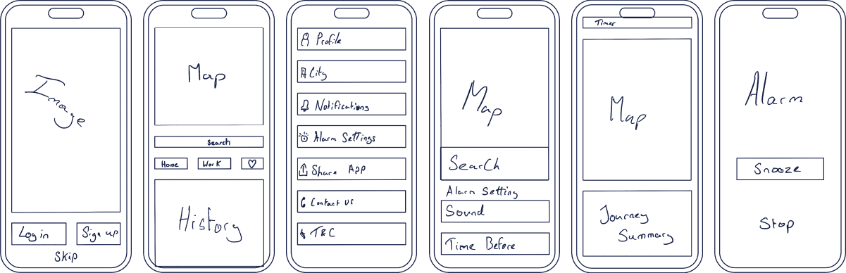
Low Fi. Wireframes
Final Screens
The Process
Every project starts with understanding the problem before designing a solution. I use the Double Diamond design process as a guide because it keeps the work focused on real user needs while ensuring the final product meets business goals.
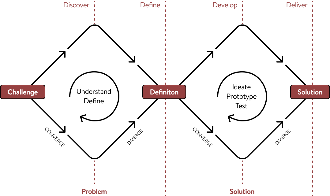
Discover (Understanding the Problem)
Before opening Figma, I take time to learn about the business, the users, and the challenges they're facing.
This might include:
- Learning about your business goals
- Understanding your target audience
- Reviewing existing products or websites
- Looking at competitors and industry trends
- Identifying pain points and opportunities
The goal is to build a clear picture of what needs to be solved—not just what needs to be designed.
Define (Creating a Clear Direction)
Once the research is complete, I organise the findings into a clear plan.
During this stage, I:
- Prioritise the biggest user and business needs
- Define project goals
- Map out user journeys
- Decide which features or pages will have the greatest impact
This creates a strong foundation before moving into design, helping avoid unnecessary revisions later.
Develop (Exploring Solutions)
With a clear direction in place, I begin designing and testing ideas.
This typically includes:
- Wireframes
- User flows
- Interface design
- Interactive prototypes
- Gathering feedback and refining the design
Rather than settling on the first idea, I explore different approaches to find the solution that works best for both users and the business.
Deliver (Building the Final Product)
The final stage is about turning the chosen solution into something ready to launch. This includes:
- High-fidelity UI designs
- Design systems and components
- Developer handoff
- Final quality checks
- Support during implementation when needed
The result is a polished, user-focused product that is designed to solve real problems, not just look good.
Why This Process Matters
Following a structured design process helps reduce guesswork, keeps projects aligned with business goals, and ensures every design decision has a purpose.
It also creates better communication throughout the project, giving clients visibility into each stage and confidence that we're solving the right problem before investing time in the final design.
The Solutions
The problems that we may come across while making Journey Jolt is:
- User Preferences: Making it easy for users to choose how they want to be notified.
- Battery Drain: Ensuring the app doesn't use too much battery power.
- Internet Issues: Dealing with times when the internet isn't guaranteed at all times.
- Testing on Different Devices: Confirming the app works well on all kinds of phones and tablets.
- Privacy and Security: Keeping user data safe and private.
- Helping Users Understand: Assuring users know how to use the app.
- Working with Train Systems: Double-checking to ensure the app can connect with different train systems. Especially with major cities that have underground train networks but also train networks that aren't that well known.


Say Hello
I’m open for freelance and permanent role opportunities. Or simply say hello, if you like the site!
LinkedIn
me@alexwaters.co.ukSite designed and built by Alex Waters
©2026
Journey Jolt (Case Study)
Have you ever tried to take a short nap on the train only to wake up and find yourself at the end of the line? How can you help passengers wake up just before the train arrives at their station?
Our train app, named Journey Jolt, is designed to revolutionise the commuting experience by eliminating the anxiety of missing your stop. With the help of advanced GPS technology, the app tracks the user's train journey in real-time and sends timely alerts just before they reach their destination. Journey Jolt offers a seamless and stress-free experience, allowing passengers to relax, read, or even catch up on sleep during their commute. The app's user interface is intuitive and customisable, allowing users to set preferences for alerts, adjust notification settings, and save frequently traveled routes for convenience. Available on both iOS and Android platforms, WakeMeTrain aims to enhance the daily commute for millions of traveler's worldwide.
The Problem
The problems that we may come across while making Journey Jolt is:
- User Preferences: Making it easy for users to choose how they want to be notified.
- Battery Drain: Ensuring the app doesn't use too much battery power.
- Internet Issues: Dealing with times when the internet isn't guaranteed at all times.
- Testing on Different Devices: Confirming the app works well on all kinds of phones and tablets.
- Privacy and Security: Keeping user data safe and private.
- Helping Users Understand: Assuring users know how to use the app.
- Working with Train Systems: Double-checking to ensure the app can connect with different train systems. Especially with major cities that have underground train networks but also train networks that aren't that well known.
User Research
Passengers often find themselves nodding off while travelling on trains due to a combination of factors affecting their circadian rhythm and environment. According to the Sleep Foundation, disruptions to one's normal sleep schedule, known as circadian rhythm, can be a key factor. Research indicates that around 20% of adults get less than 6 hours of sleep on weeknights, which can contribute to increased drowsiness during travel. Travelling by train often involves early morning or late-night journeys, which can interfere with the body's natural sleep-wake cycle. A study by the UK's Office of Rail and Road found that over 40% of passengers use trains for commuting, with many of these journeys occurring during peak sleep times. Additionally, the rhythmic motion and gentle swaying of the train, as discussed in Elle, create a soothing environment conducive to relaxation and sleep. This motion mimics the sensation of being rocked to sleep, triggering a sense of calmness and comfort. Furthermore, the familiar sounds of the train and the relative privacy of one's seat contribute to a feeling of safety and security, further encouraging passengers to drift off. Combined with the often monotonous scenery passing by, the train carriage becomes an ideal setting for a quick nap, especially for tired commuters or travellers. Sourced from the Sleep Foundation
Competition Analysis
Over the 6 most popular apps for train travel, over half of them have the option to notify the user when the train is coming to their destination. Here is my findings.
Google Maps, Apple Maps, Moovit, & Citymapper: Has “Get off” Alert
Transit, Rail Planner, & Trainline: Doesn’t have alerts/ Notification for when the users station is coming up.
From theses finding, it shows that there is a gap in the market for a train application that alarms the users when they are coming up to their destination, as the most popular applications only notify the user. The worry for some notifications is that the user won’t hear them (and not wake them up) or some people have their phone on silent so this notification won’t be seen until they have woken up at the end of the line.
Define Stage
Workshop
User Personas
The Challenges
Modernising an existing style guide
One of the key challenges was updating an outdated design system while keeping it recognisable and intuitive for Fanvue’s existing, older user base. Striking the right balance between innovation and familiarity required careful design decisions to ensure that new patterns were both forward-looking and user-friendly.
Mobile-first and cross-platform consistency
Adopting a mobile-first approach was crucial, but ensuring a seamless experience across a wide range of devices demanded close coordination with the development team. Each component needed to scale elegantly from mobile to desktop, while maintaining visual hierarchy, interaction patterns, and brand consistency.
Light and dark mode integration
Implementing a flexible system that supported quick toggling between light and dark modes introduced technical complexity. Adapting Figma’s variables for both modes across desktop and mobile designs required meticulous attention to detail to maintain colour contrast, visual harmony, and accessibility compliance.
Accessibility and usability standards
Ensuring the updated design system met WCAG AA+ standards presented additional design constraints, particularly when modernising elements like typography, buttons, and forms. The system had to improve accessibility without compromising aesthetic appeal or the playful, engaging tone of the platform.
Efficiency and scalability
Finally, the system needed to support rapid design iteration and handoff to developers. Creating a reusable, scalable framework that could accommodate future products and features demanded both strategic foresight and careful technical planning.
Initial Ideas
Research
Brand and Experience Requirements
Flow Map
Design
Colour & Typography
Low Fi. Wireframes
Final Screens
The Process
Every project starts with understanding the problem before designing a solution. I use the Double Diamond design process as a guide because it keeps the work focused on real user needs while ensuring the final product meets business goals.
Discover (Understanding the Problem)
Before opening Figma, I take time to learn about the business, the users, and the challenges they're facing.
This might include:
- Learning about your business goals
- Understanding your target audience
- Reviewing existing products or websites
- Looking at competitors and industry trends
- Identifying pain points and opportunities
The goal is to build a clear picture of what needs to be solved—not just what needs to be designed.
Define (Creating a Clear Direction)
Once the research is complete, I organise the findings into a clear plan.
During this stage, I:
- Prioritise the biggest user and business needs
- Define project goals
- Map out user journeys
- Decide which features or pages will have the greatest impact
This creates a strong foundation before moving into design, helping avoid unnecessary revisions later.
Develop (Exploring Solutions)
With a clear direction in place, I begin designing and testing ideas.
This typically includes:
- Wireframes
- User flows
- Interface design
- Interactive prototypes
- Gathering feedback and refining the design
Rather than settling on the first idea, I explore different approaches to find the solution that works best for both users and the business.
Deliver (Building the Final Product)
The final stage is about turning the chosen solution into something ready to launch. This includes:
- High-fidelity UI designs
- Design systems and components
- Developer handoff
- Final quality checks
- Support during implementation when needed
The result is a polished, user-focused product that is designed to solve real problems, not just look good.
Why This Process Matters
Following a structured design process helps reduce guesswork, keeps projects aligned with business goals, and ensures every design decision has a purpose.
It also creates better communication throughout the project, giving clients visibility into each stage and confidence that we're solving the right problem before investing time in the final design.
The Solutions
The problems that we may come across while making Journey Jolt is:
- User Preferences: Making it easy for users to choose how they want to be notified.
- Battery Drain: Ensuring the app doesn't use too much battery power.
- Internet Issues: Dealing with times when the internet isn't guaranteed at all times.
- Testing on Different Devices: Confirming the app works well on all kinds of phones and tablets.
- Privacy and Security: Keeping user data safe and private.
- Helping Users Understand: Assuring users know how to use the app.
- Working with Train Systems: Double-checking to ensure the app can connect with different train systems. Especially with major cities that have underground train networks but also train networks that aren't that well known.

Site designed and built by Alex Waters
©2026
Say Hello
I’m open for freelance and permanent role opportunities. Or simply say hello, if you like the site!
LinkedIn
me@alexwaters.co.uk