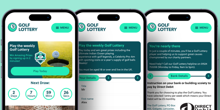
Golf Lottery
A series of branded competition pages created in partnership between leading brands and Global’s radio stations, including Capital FM, Radio X, Smooth, Classic FM, and more. These campaigns combined brand messaging with the stations’ audiences to drive engagement, awareness, and participation.
This project was to increase conversion rates on a Golf Lottery website involves improving various aspects of the website to attract more visitors and encourage them to sign up for the lottery. Here are some strategies that we used to increase the conversion rates:
- Improve the website design: The website design should be visually appealing, easy to navigate, and responsive. Visitors should be able to find what they're looking for quickly and efficiently.
- Create clear and compelling messaging: The website's messaging should be clear and concise, highlighting the benefits of participating in the golf lottery, such as the chance to win exclusive prizes, support charitable causes, or gain access to exclusive events.\Offer social proof: Display testimonials from past winners or satisfied customers to build trust and credibility. This social proof will encourage visitors to participate in the lottery, as they will be assured that the process is legitimate.
- Simplify the sign-up process: Make the sign-up process as easy and straightforward as possible. This could include reducing the number of form fields required or offering social media sign-up options.
- Use email marketing: Use email marketing to keep your subscribers informed about upcoming lotteries, special offers, and other updates related to the golf lottery. This will help to keep them engaged and increase the likelihood of them participating in the lottery.
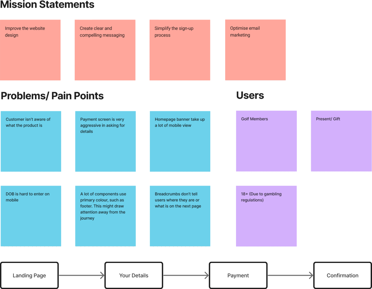
By implementing these strategies, you can increase the conversion rate on your golf lottery website, attract more visitors, and ultimately grow your business. These are also the mission statements

Client
Global
Role
Senior UX/ UI Designer
Team
3 Designers, 3 Developers and 1PM
Timeframe
Jan 2025 - Oc 2025

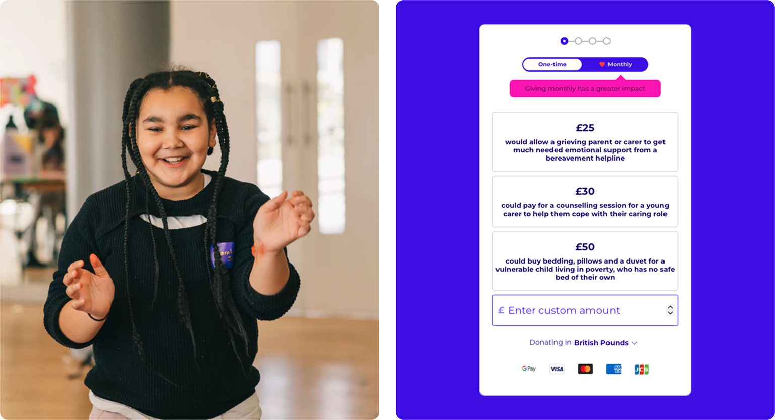
The Problem
The primary challenge was the pace of delivery. Each co-branded site had a very short turnaround, often just two to three days from brief to final design. This meant quickly understanding new brand guidelines, campaign objectives, and audience expectations, while still maintaining a high standard of creative and strategic thinking.
It was also demanding to context-switch between multiple briefs running in parallel. At times, this meant shifting focus to a new campaign before another was fully complete, requiring strong organisation, mental agility, and the ability to stay creatively consistent under pressure.
The previous visual identity lacked energy and warmth, relying heavily on dense copy and static layouts. The challenge was to evolve the design language into something more modern, vibrant, and emotionally engaging — without alienating existing supporters or losing brand recognition.
Balancing playfulness with credibility
Make Some Noise operates in a unique space: fun, music-led campaigns supporting deeply serious causes such as mental health, domestic abuse recovery, and family care. The redesign had to strike a careful balance — maintaining joy, optimism, and momentum, while treating the subject matter with sensitivity and respect.
Improving the donation journey
The original donation flow lacked urgency and emotional connection. I needed to simplify the journey, improve visual hierarchy, and use storytelling, colour, and clear calls to action to encourage users to move from awareness to action — without feeling pressured or overwhelmed.
Cross-team alignment
With input from editorial, radio, charity leads, and digital teams, aligning priorities and feedback was an ongoing challenge. This required clear communication, rapid iteration, and a flexible design approach that could accommodate different perspectives while protecting the integrity of the overall experience.
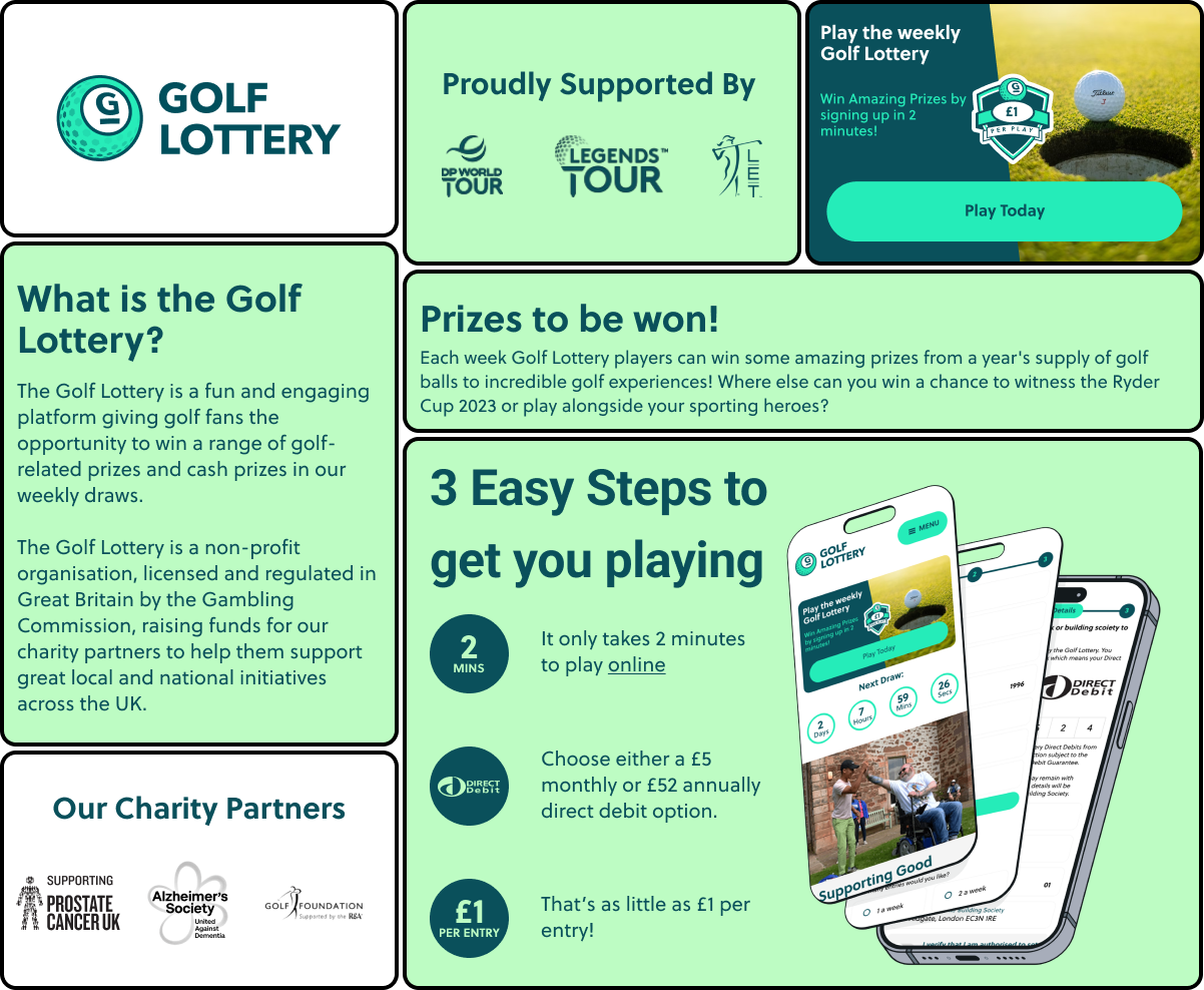
What is the Golf Lottery?
The Golf Lottery is a fun and engaging platform for golfing fans to win a range of prizes in a weekly draw. This new and unique lottery gives golf fans the opportunity to support charities within golf. The Golf Lottery is a nonprofit organisation, licensed and regulated in Great Britain by the Gambling Commission. The two objective of the Golf Lottery is:
- Raising funds for golf supported charities. Golfer’s passion for the game will sustain charities supporting sport and golf in the United Kingdom. It’s a new way of raising funds, with the aim of developing the sport from a grass roots level for communities under-represented in the game and supporting diversity and inclusivity.
- Every week Golf Lottery players will have the chance to win prizes from cash, tournament tickets to merchandise and golf products. The big prizes will include playing experiences wih Celebrities, Major winners and Ryder Cup Captains, through to VIP hospitality at major golf events including private travel and luxury accommodation.
Benefits of Golf Lottery
The Golf Lottery is a fundraising tool providing your members and followers with the opportunity to contribute to your charity causes through a fun and entertaining mechanism.
It will provide a simple solution to assist with meeting your charitable donation targets. Set up with the same ethos, the Golf Lottery will work with and support golf's governing bodies to drive golf in a positive direction.
This is a unique opportunity as there are no direct competitors that currently exist in the golf sector.
For the consumer, the Golf Lottery is an exciting new platform on which to play to win prizes as well as support meaningful charities.
How it works
Playing is simple on the mobile responsive platform launching April 2022 with an App to follow later in the year. There are two ways to play:
- Monthly Subscription: with a direct debit of £5 per calendar month.
- Annual Subscription: with a direct debit of £52 per year.
Highlights
I led a research and design process, supported by a talented Digital Product Owner while working remotely and in the Bank WeWork office. Our efforts led to the discovery of valuable user insights, numerous user experience improvements, and a validated long-term design direction for the future development.
- Making customer aware of how much the service is. This is useful as one of the main problems that we’re facing is that the customer panics when they see the bank details page so early on in the journey (as there is only 3 pages, it was quite hard to sell the customer the idea of the golf lottery and get them to sign up at the same time)
- Introducing more people to the Golf Lottery. The main problem with the product, is that not enough people knew about it, looking through data and marketing, there was some easy fixes. For example, a friendlier email to introduce users to the product, and making people aware of what the service is.
- Rebranding for a customer friend journey. While looking through heat maps, we could see that the customer didn’t know what to do when they got on the landing page. There was no direct button that said “click me to continue”. This was a simple fix by changing the banner and making the branding more user friendly (as you can see below).
My Process
Workshops
The workshop we did was a collaborative session where designers, stakeholders, and users come together to identify and solve problems related to user experience. Here are some things we did in our workshop:
- Identify pain points: Identify pain points in the user journey, such as confusing navigation, slow page loading, or difficult checkout process.
- Define the purpose: Start by defining the purpose of the workshop, such as improving the usability of a product, identifying pain points.
- Define the Users: Identify who will participate in the workshop, including designers, developers, stakeholders, and users.
- Conduct user research: Use data from user interviews, surveys, and analytics to understand user needs, goals, and behaviour.
Overall, a UX workshop is a collaborative and iterative process that helps to improve the user experience of a product or service. By involving designers, developers, stakeholders, and users, you can create solutions that meet the needs of your target audience.
Changes that were made
Asking at the right point
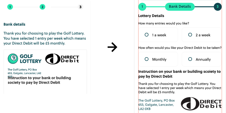
Moving lottery details to payment screen - originally this was on the ‘Your Details’ page at the top, but this felt to aggressive for the first questions to be about how many time would you like to enter the lottery. Another reason for this change was because the question is regarding payment, so it feels better to all be on the payment screen. This also fixes another problem we found in the analytics. The first question on the payment screen page was asking for your bank details, and as this is such a short journey (3 pages), this allowed the user to understand what they are putting their bank details in for.
Homepage Banner
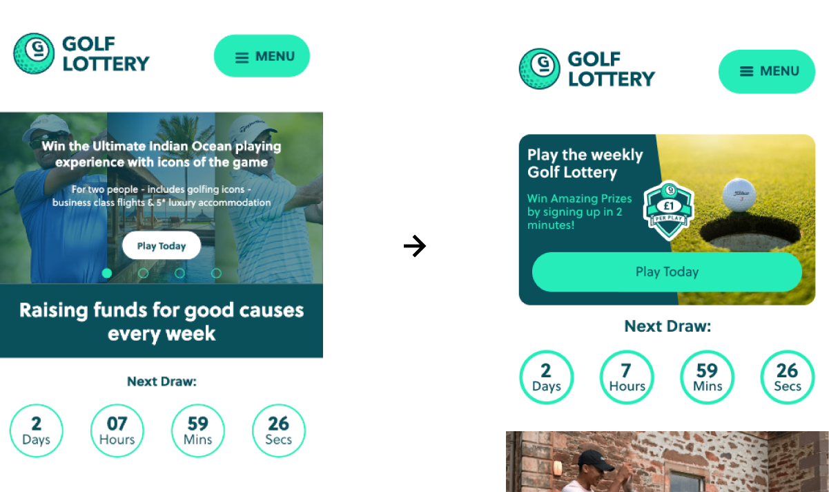
Changing the Homepage Banner to fit in with the style of the site - Most customers come from the email. Changing the top banner to fit with what they have seen on the email bring familiarity. Smaller header in height allows the customer to be sold by more of the site. Bigger button bring the customer attention to what they need to do next
DOB & Sort Code Fields
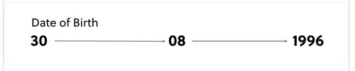
Setting the DOB and Sort code fields to jump to the next without the customer clicking on each box makes it a lot easy to type (Especially on mobile). Auto tabbing to the next input field is a good thing in UX for several reasons: Increased efficiency: Auto tabbing can save time and effort for users, as they don't need to manually click or tap to move to the next input field. This can be especially beneficial for forms with many fields or for users with mobility or dexterity issues. Improved accuracy: By automatically moving to the next input field, the risk of errors or omissions is reduced. Users are less likely to accidentally skip a field or enter information in the wrong field, as the focus is automatically shifted to the next appropriate input field. Consistency: Auto tabbing can provide a consistent experience for users across different forms and websites. Users will know what to expect and can quickly and easily navigate through the form without having to learn a new interface or interaction pattern. Reduced cognitive load: Auto tabbing can reduce cognitive load for users by simplifying the process of filling out a form. Users can focus on entering the required information without having to think about the mechanics of moving between fields.
Using primary colours at the right time
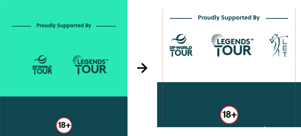
Change the colour of the ‘Proudly supported by’ background colour so the continue button stands out and the customer isn’t Distracted by the same colour in the background. Using the primary color at the right time in UX is important because it can help to create a visual hierarchy and guide the user's attention to the most important elements on the screen. Here are a few reasons why it's beneficial to use the primary color sparingly and strategically:
- Emphasise important elements: By using the primary color sparingly, it becomes a visual cue that draws the user's attention to the most important elements on the screen, such as calls to action or critical information. This helps to create a clear visual hierarchy and guides the user's focus to the elements that are most important for achieving their goals.
- Avoid overwhelming the user: Overuse of the primary color can be visually overwhelming and make it difficult for the user to understand what they need to focus on. By using the primary color strategically, the designer can avoid overwhelming the user and provide a clear, uncluttered interface.
- Maintain brand consistency: The primary color is often a key element in a brand's visual identity, and overuse can dilute its impact and create a less cohesive brand image. By using the primary color strategically, designers can maintain consistency with the brand's visual identity while still providing a functional and effective user interface.
- Enhance user experience: When used appropriately, the primary color can enhance the user experience by providing clear visual cues and guiding the user's attention. This can improve usability, help users achieve their goals more efficiently, and create a more enjoyable and engaging user experience overall.
Breadcrumbs Best Practice
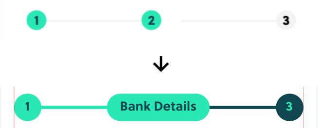
Change breadcrumbs designs to better fit mobile and give more space to the page. This also allows the user to see what is coming next, unlike how the previous version was when it was just stating how many pages there were. Breadcrumbs are a useful design element in UX that help users understand where they are within a website or application, and how they can navigate to other pages or sections. Here are a few reasons why breadcrumbs are beneficial for UX: Improves website navigation: Breadcrumbs provide a clear and easy-to-use navigation aid that allows users to quickly understand where they are within a website or application, and how they can move to other pages or sections. This helps users to find the information they are looking for more quickly and easily, improving the overall user experience. Enhances user confidence: Breadcrumbs can help to build user confidence and reduce anxiety by providing a clear path for users to follow. This can be especially useful for users who are unfamiliar with the website or application, or who may be feeling overwhelmed or unsure about where to go next. Provides context: Breadcrumbs provide context to users by showing them how the current page or section fits within the overall structure of the website or application. This can help users to better understand the information they are viewing and its relationship to other content on the site.
The Process
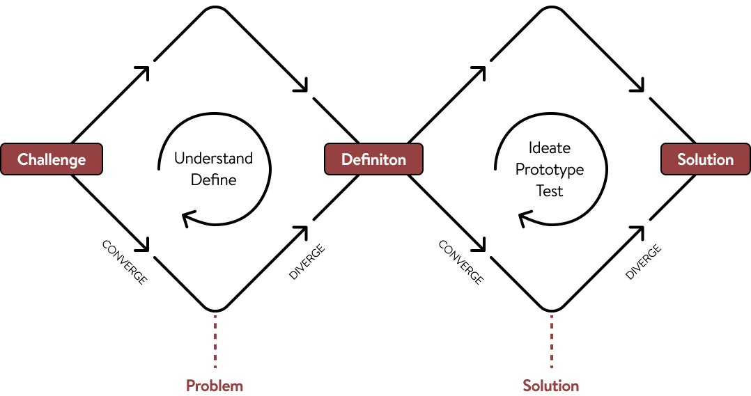
Every project starts with understanding the problem before designing a solution. I use the Double Diamond design process as a guide because it keeps the work focused on real user needs while ensuring the final product meets business goals.

Discover

Define
Develop

Deliver

Why This Process Matters
Following a structured design process helps reduce guesswork, keeps projects aligned with business goals, and ensures every design decision has a purpose.
It also creates better communication throughout the project, giving clients visibility into each stage and confidence that we're solving the right problem before investing time in the final design.
What is the Golf Lottery?
The Golf Lottery is a fun and engaging platform for golfing fans to win a range of prizes in a weekly draw. This new and unique lottery gives golf fans the opportunity to support charities within golf. The Golf Lottery is a nonprofit organisation, licensed and regulated in Great Britain by the Gambling Commission. The two objective of the Golf Lottery is:
- Raising funds for golf supported charities. Golfer’s passion for the game will sustain charities supporting sport and golf in the United Kingdom. It’s a new way of raising funds, with the aim of developing the sport from a grass roots level for communities under-represented in the game and supporting diversity and inclusivity.
- Every week Golf Lottery players will have the chance to win prizes from cash, tournament tickets to merchandise and golf products. The big prizes will include playing experiences wih Celebrities, Major winners and Ryder Cup Captains, through to VIP hospitality at major golf events including private travel and luxury accommodation.
Benefits of Golf Lottery
The Golf Lottery is a fundraising tool providing your members and followers with the opportunity to contribute to your charity causes through a fun and entertaining mechanism.
It will provide a simple solution to assist with meeting your charitable donation targets. Set up with the same ethos, the Golf Lottery will work with and support golf's governing bodies to drive golf in a positive direction.
This is a unique opportunity as there are no direct competitors that currently exist in the golf sector.
For the consumer, the Golf Lottery is an exciting new platform on which to play to win prizes as well as support meaningful charities.
How it works
Playing is simple on the mobile responsive platform launching April 2022 with an App to follow later in the year. There are two ways to play:
- Monthly Subscription: with a direct debit of £5 per calendar month.
- Annual Subscription: with a direct debit of £52 per year.
Highlights
I led a research and design process, supported by a talented Digital Product Owner while working remotely and in the Bank WeWork office. Our efforts led to the discovery of valuable user insights, numerous user experience improvements, and a validated long-term design direction for the future development.
- Making customer aware of how much the service is. This is useful as one of the main problems that we’re facing is that the customer panics when they see the bank details page so early on in the journey (as there is only 3 pages, it was quite hard to sell the customer the idea of the golf lottery and get them to sign up at the same time)
- Introducing more people to the Golf Lottery. The main problem with the product, is that not enough people knew about it, looking through data and marketing, there was some easy fixes. For example, a friendlier email to introduce users to the product, and making people aware of what the service is.
- Rebranding for a customer friend journey. While looking through heat maps, we could see that the customer didn’t know what to do when they got on the landing page. There was no direct button that said “click me to continue”. This was a simple fix by changing the banner and making the branding more user friendly (as you can see below).
My Process
Workshops
The workshop we did was a collaborative session where designers, stakeholders, and users come together to identify and solve problems related to user experience. Here are some things we did in our workshop:
- Identify pain points: Identify pain points in the user journey, such as confusing navigation, slow page loading, or difficult checkout process.
- Define the purpose: Start by defining the purpose of the workshop, such as improving the usability of a product, identifying pain points.
- Define the Users: Identify who will participate in the workshop, including designers, developers, stakeholders, and users.
- Conduct user research: Use data from user interviews, surveys, and analytics to understand user needs, goals, and behaviour.
Overall, a UX workshop is a collaborative and iterative process that helps to improve the user experience of a product or service. By involving designers, developers, stakeholders, and users, you can create solutions that meet the needs of your target audience.
Changes that were made
Asking at the right point
Moving lottery details to payment screen - originally this was on the ‘Your Details’ page at the top, but this felt to aggressive for the first questions to be about how many time would you like to enter the lottery. Another reason for this change was because the question is regarding payment, so it feels better to all be on the payment screen. This also fixes another problem we found in the analytics. The first question on the payment screen page was asking for your bank details, and as this is such a short journey (3 pages), this allowed the user to understand what they are putting their bank details in for.
Homepage Banner
Changing the Homepage Banner to fit in with the style of the site - Most customers come from the email. Changing the top banner to fit with what they have seen on the email bring familiarity. Smaller header in height allows the customer to be sold by more of the site. Bigger button bring the customer attention to what they need to do next
DOB & Sort Code Fields
Setting the DOB and Sort code fields to jump to the next without the customer clicking on each box makes it a lot easy to type (Especially on mobile). Auto tabbing to the next input field is a good thing in UX for several reasons: Increased efficiency: Auto tabbing can save time and effort for users, as they don't need to manually click or tap to move to the next input field. This can be especially beneficial for forms with many fields or for users with mobility or dexterity issues. Improved accuracy: By automatically moving to the next input field, the risk of errors or omissions is reduced. Users are less likely to accidentally skip a field or enter information in the wrong field, as the focus is automatically shifted to the next appropriate input field. Consistency: Auto tabbing can provide a consistent experience for users across different forms and websites. Users will know what to expect and can quickly and easily navigate through the form without having to learn a new interface or interaction pattern. Reduced cognitive load: Auto tabbing can reduce cognitive load for users by simplifying the process of filling out a form. Users can focus on entering the required information without having to think about the mechanics of moving between fields.
Using primary colours at the right time
Change the colour of the ‘Proudly supported by’ background colour so the continue button stands out and the customer isn’t Distracted by the same colour in the background. Using the primary color at the right time in UX is important because it can help to create a visual hierarchy and guide the user's attention to the most important elements on the screen. Here are a few reasons why it's beneficial to use the primary color sparingly and strategically:
- Emphasise important elements: By using the primary color sparingly, it becomes a visual cue that draws the user's attention to the most important elements on the screen, such as calls to action or critical information. This helps to create a clear visual hierarchy and guides the user's focus to the elements that are most important for achieving their goals.
- Avoid overwhelming the user: Overuse of the primary color can be visually overwhelming and make it difficult for the user to understand what they need to focus on. By using the primary color strategically, the designer can avoid overwhelming the user and provide a clear, uncluttered interface.
- Maintain brand consistency: The primary color is often a key element in a brand's visual identity, and overuse can dilute its impact and create a less cohesive brand image. By using the primary color strategically, designers can maintain consistency with the brand's visual identity while still providing a functional and effective user interface.
- Enhance user experience: When used appropriately, the primary color can enhance the user experience by providing clear visual cues and guiding the user's attention. This can improve usability, help users achieve their goals more efficiently, and create a more enjoyable and engaging user experience overall.
Breadcrumbs Best Practice
Change breadcrumbs designs to better fit mobile and give more space to the page. This also allows the user to see what is coming next, unlike how the previous version was when it was just stating how many pages there were. Breadcrumbs are a useful design element in UX that help users understand where they are within a website or application, and how they can navigate to other pages or sections. Here are a few reasons why breadcrumbs are beneficial for UX: Improves website navigation: Breadcrumbs provide a clear and easy-to-use navigation aid that allows users to quickly understand where they are within a website or application, and how they can move to other pages or sections. This helps users to find the information they are looking for more quickly and easily, improving the overall user experience. Enhances user confidence: Breadcrumbs can help to build user confidence and reduce anxiety by providing a clear path for users to follow. This can be especially useful for users who are unfamiliar with the website or application, or who may be feeling overwhelmed or unsure about where to go next. Provides context: Breadcrumbs provide context to users by showing them how the current page or section fits within the overall structure of the website or application. This can help users to better understand the information they are viewing and its relationship to other content on the site.


Say Hello
I’m open for freelance and permanent role opportunities. Or simply say hello, if you like the site!
LinkedIn
me@alexwaters.co.ukSite designed and built by Alex Waters
©2026
Golf Lottery
increasing conversion rates on a Golf Lottery website involves improving various aspects of the website to attract more visitors and encourage them to sign up for the lottery
This project was to increase conversion rates on a Golf Lottery website involves improving various aspects of the website to attract more visitors and encourage them to sign up for the lottery. Here are some strategies that we used to increase the conversion rates:
- Improve the website design: The website design should be visually appealing, easy to navigate, and responsive. Visitors should be able to find what they're looking for quickly and efficiently.
- Create clear and compelling messaging: The website's messaging should be clear and concise, highlighting the benefits of participating in the golf lottery, such as the chance to win exclusive prizes, support charitable causes, or gain access to exclusive events.\Offer social proof: Display testimonials from past winners or satisfied customers to build trust and credibility. This social proof will encourage visitors to participate in the lottery, as they will be assured that the process is legitimate.
- Simplify the sign-up process: Make the sign-up process as easy and straightforward as possible. This could include reducing the number of form fields required or offering social media sign-up options.
- Use email marketing: Use email marketing to keep your subscribers informed about upcoming lotteries, special offers, and other updates related to the golf lottery. This will help to keep them engaged and increase the likelihood of them participating in the lottery.
By implementing these strategies, you can increase the conversion rate on your golf lottery website, attract more visitors, and ultimately grow your business. These are also the mission statements

Client
Global
Role
Senior UX/ UI Designer
Team
2 Designers, 3 Developers and 1PM
Timeframe
July 2025 - September 2025
The Problem
The primary challenge was the pace of delivery. Each co-branded site had a very short turnaround, often just two to three days from brief to final design. This meant quickly understanding new brand guidelines, campaign objectives, and audience expectations, while still maintaining a high standard of creative and strategic thinking.
Shifting user perception
It was also demanding to context-switch between multiple briefs running in parallel. At times, this meant shifting focus to a new campaign before another was fully complete, requiring strong organisation, mental agility, and the ability to stay creatively consistent under pressure.
The existing site positioned competitions as the primary interaction point, which risked overshadowing the charity’s core purpose. A key challenge was reframing Make Some Noise as a charity-first platform, while still preserving the excitement and accessibility that competitions bring. The experience needed to feel purpose-led without becoming overly serious or transactional.
Outdated and text-heavy experience
The previous visual identity lacked energy and warmth, relying heavily on dense copy and static layouts. The challenge was to evolve the design language into something more modern, vibrant, and emotionally engaging — without alienating existing supporters or losing brand recognition.
Balancing playfulness with credibility
Make Some Noise operates in a unique space: fun, music-led campaigns supporting deeply serious causes such as mental health, domestic abuse recovery, and family care. The redesign had to strike a careful balance — maintaining joy, optimism, and momentum, while treating the subject matter with sensitivity and respect.
Improving the donation journey
The original donation flow lacked urgency and emotional connection. I needed to simplify the journey, improve visual hierarchy, and use storytelling, colour, and clear calls to action to encourage users to move from awareness to action — without feeling pressured or overwhelmed.
Cross-team alignment
With input from editorial, radio, charity leads, and digital teams, aligning priorities and feedback was an ongoing challenge. This required clear communication, rapid iteration, and a flexible design approach that could accommodate different perspectives while protecting the integrity of the overall experience.
What is the Golf Lottery?
The Golf Lottery is a fun and engaging platform for golfing fans to win a range of prizes in a weekly draw. This new and unique lottery gives golf fans the opportunity to support charities within golf. The Golf Lottery is a nonprofit organisation, licensed and regulated in Great Britain by the Gambling Commission. The two objective of the Golf Lottery is:
- Raising funds for golf supported charities. Golfer’s passion for the game will sustain charities supporting sport and golf in the United Kingdom. It’s a new way of raising funds, with the aim of developing the sport from a grass roots level for communities under-represented in the game and supporting diversity and inclusivity.
- Every week Golf Lottery players will have the chance to win prizes from cash, tournament tickets to merchandise and golf products. The big prizes will include playing experiences wih Celebrities, Major winners and Ryder Cup Captains, through to VIP hospitality at major golf events including private travel and luxury accommodation.
Benefits of Golf Lottery
The Golf Lottery is a fundraising tool providing your members and followers with the opportunity to contribute to your charity causes through a fun and entertaining mechanism.
It will provide a simple solution to assist with meeting your charitable donation targets. Set up with the same ethos, the Golf Lottery will work with and support golf's governing bodies to drive golf in a positive direction.
This is a unique opportunity as there are no direct competitors that currently exist in the golf sector.
For the consumer, the Golf Lottery is an exciting new platform on which to play to win prizes as well as support meaningful charities.
How it works
Playing is simple on the mobile responsive platform launching April 2022 with an App to follow later in the year. There are two ways to play:
- Monthly Subscription: with a direct debit of £5 per calendar month.
- Annual Subscription: with a direct debit of £52 per year.
Highlights
I led a research and design process, supported by a talented Digital Product Owner while working remotely and in the Bank WeWork office. Our efforts led to the discovery of valuable user insights, numerous user experience improvements, and a validated long-term design direction for the future development.
- Making customer aware of how much the service is. This is useful as one of the main problems that we’re facing is that the customer panics when they see the bank details page so early on in the journey (as there is only 3 pages, it was quite hard to sell the customer the idea of the golf lottery and get them to sign up at the same time)
- Introducing more people to the Golf Lottery. The main problem with the product, is that not enough people knew about it, looking through data and marketing, there was some easy fixes. For example, a friendlier email to introduce users to the product, and making people aware of what the service is.
- Rebranding for a customer friend journey. While looking through heat maps, we could see that the customer didn’t know what to do when they got on the landing page. There was no direct button that said “click me to continue”. This was a simple fix by changing the banner and making the branding more user friendly (as you can see below).
My Process
Workshops
The workshop we did was a collaborative session where designers, stakeholders, and users come together to identify and solve problems related to user experience. Here are some things we did in our workshop:
- Identify pain points: Identify pain points in the user journey, such as confusing navigation, slow page loading, or difficult checkout process.
- Define the purpose: Start by defining the purpose of the workshop, such as improving the usability of a product, identifying pain points.
- Define the Users: Identify who will participate in the workshop, including designers, developers, stakeholders, and users.
- Conduct user research: Use data from user interviews, surveys, and analytics to understand user needs, goals, and behaviour.
Overall, a UX workshop is a collaborative and iterative process that helps to improve the user experience of a product or service. By involving designers, developers, stakeholders, and users, you can create solutions that meet the needs of your target audience.
Changes that were made
Asking at the right point
Moving lottery details to payment screen - originally this was on the ‘Your Details’ page at the top, but this felt to aggressive for the first questions to be about how many time would you like to enter the lottery. Another reason for this change was because the question is regarding payment, so it feels better to all be on the payment screen. This also fixes another problem we found in the analytics. The first question on the payment screen page was asking for your bank details, and as this is such a short journey (3 pages), this allowed the user to understand what they are putting their bank details in for.
Homepage Banner
Changing the Homepage Banner to fit in with the style of the site - Most customers come from the email. Changing the top banner to fit with what they have seen on the email bring familiarity. Smaller header in height allows the customer to be sold by more of the site. Bigger button bring the customer attention to what they need to do next
DOB & Sort Code Fields
Setting the DOB and Sort code fields to jump to the next without the customer clicking on each box makes it a lot easy to type (Especially on mobile). Auto tabbing to the next input field is a good thing in UX for several reasons: Increased efficiency: Auto tabbing can save time and effort for users, as they don't need to manually click or tap to move to the next input field. This can be especially beneficial for forms with many fields or for users with mobility or dexterity issues. Improved accuracy: By automatically moving to the next input field, the risk of errors or omissions is reduced. Users are less likely to accidentally skip a field or enter information in the wrong field, as the focus is automatically shifted to the next appropriate input field. Consistency: Auto tabbing can provide a consistent experience for users across different forms and websites. Users will know what to expect and can quickly and easily navigate through the form without having to learn a new interface or interaction pattern. Reduced cognitive load: Auto tabbing can reduce cognitive load for users by simplifying the process of filling out a form. Users can focus on entering the required information without having to think about the mechanics of moving between fields.
Using primary colours at the right time
Change the colour of the ‘Proudly supported by’ background colour so the continue button stands out and the customer isn’t Distracted by the same colour in the background. Using the primary color at the right time in UX is important because it can help to create a visual hierarchy and guide the user's attention to the most important elements on the screen. Here are a few reasons why it's beneficial to use the primary color sparingly and strategically:
- Emphasise important elements: By using the primary color sparingly, it becomes a visual cue that draws the user's attention to the most important elements on the screen, such as calls to action or critical information. This helps to create a clear visual hierarchy and guides the user's focus to the elements that are most important for achieving their goals.
- Avoid overwhelming the user: Overuse of the primary color can be visually overwhelming and make it difficult for the user to understand what they need to focus on. By using the primary color strategically, the designer can avoid overwhelming the user and provide a clear, uncluttered interface.
- Maintain brand consistency: The primary color is often a key element in a brand's visual identity, and overuse can dilute its impact and create a less cohesive brand image. By using the primary color strategically, designers can maintain consistency with the brand's visual identity while still providing a functional and effective user interface.
- Enhance user experience: When used appropriately, the primary color can enhance the user experience by providing clear visual cues and guiding the user's attention. This can improve usability, help users achieve their goals more efficiently, and create a more enjoyable and engaging user experience overall.
Breadcrumbs Best Practice
Change breadcrumbs designs to better fit mobile and give more space to the page. This also allows the user to see what is coming next, unlike how the previous version was when it was just stating how many pages there were. Breadcrumbs are a useful design element in UX that help users understand where they are within a website or application, and how they can navigate to other pages or sections. Here are a few reasons why breadcrumbs are beneficial for UX: Improves website navigation: Breadcrumbs provide a clear and easy-to-use navigation aid that allows users to quickly understand where they are within a website or application, and how they can move to other pages or sections. This helps users to find the information they are looking for more quickly and easily, improving the overall user experience. Enhances user confidence: Breadcrumbs can help to build user confidence and reduce anxiety by providing a clear path for users to follow. This can be especially useful for users who are unfamiliar with the website or application, or who may be feeling overwhelmed or unsure about where to go next. Provides context: Breadcrumbs provide context to users by showing them how the current page or section fits within the overall structure of the website or application. This can help users to better understand the information they are viewing and its relationship to other content on the site.
The Process
Every project starts with understanding the problem before designing a solution. I use the Double Diamond design process as a guide because it keeps the work focused on real user needs while ensuring the final product meets business goals.
Discover
Define
Develop
Deliver
Why This Process Matters
Following a structured design process helps reduce guesswork, keeps projects aligned with business goals, and ensures every design decision has a purpose.
It also creates better communication throughout the project, giving clients visibility into each stage and confidence that we're solving the right problem before investing time in the final design.
What is the Golf Lottery?
The Golf Lottery is a fun and engaging platform for golfing fans to win a range of prizes in a weekly draw. This new and unique lottery gives golf fans the opportunity to support charities within golf. The Golf Lottery is a nonprofit organisation, licensed and regulated in Great Britain by the Gambling Commission. The two objective of the Golf Lottery is:
- Raising funds for golf supported charities. Golfer’s passion for the game will sustain charities supporting sport and golf in the United Kingdom. It’s a new way of raising funds, with the aim of developing the sport from a grass roots level for communities under-represented in the game and supporting diversity and inclusivity.
- Every week Golf Lottery players will have the chance to win prizes from cash, tournament tickets to merchandise and golf products. The big prizes will include playing experiences wih Celebrities, Major winners and Ryder Cup Captains, through to VIP hospitality at major golf events including private travel and luxury accommodation.
Benefits of Golf Lottery
The Golf Lottery is a fundraising tool providing your members and followers with the opportunity to contribute to your charity causes through a fun and entertaining mechanism.
It will provide a simple solution to assist with meeting your charitable donation targets. Set up with the same ethos, the Golf Lottery will work with and support golf's governing bodies to drive golf in a positive direction.
This is a unique opportunity as there are no direct competitors that currently exist in the golf sector.
For the consumer, the Golf Lottery is an exciting new platform on which to play to win prizes as well as support meaningful charities.
How it works
Playing is simple on the mobile responsive platform launching April 2022 with an App to follow later in the year. There are two ways to play:
- Monthly Subscription: with a direct debit of £5 per calendar month.
- Annual Subscription: with a direct debit of £52 per year.
Highlights
I led a research and design process, supported by a talented Digital Product Owner while working remotely and in the Bank WeWork office. Our efforts led to the discovery of valuable user insights, numerous user experience improvements, and a validated long-term design direction for the future development.
- Making customer aware of how much the service is. This is useful as one of the main problems that we’re facing is that the customer panics when they see the bank details page so early on in the journey (as there is only 3 pages, it was quite hard to sell the customer the idea of the golf lottery and get them to sign up at the same time)
- Introducing more people to the Golf Lottery. The main problem with the product, is that not enough people knew about it, looking through data and marketing, there was some easy fixes. For example, a friendlier email to introduce users to the product, and making people aware of what the service is.
- Rebranding for a customer friend journey. While looking through heat maps, we could see that the customer didn’t know what to do when they got on the landing page. There was no direct button that said “click me to continue”. This was a simple fix by changing the banner and making the branding more user friendly (as you can see below).
My Process
Workshops
The workshop we did was a collaborative session where designers, stakeholders, and users come together to identify and solve problems related to user experience. Here are some things we did in our workshop:
- Identify pain points: Identify pain points in the user journey, such as confusing navigation, slow page loading, or difficult checkout process.
- Define the purpose: Start by defining the purpose of the workshop, such as improving the usability of a product, identifying pain points.
- Define the Users: Identify who will participate in the workshop, including designers, developers, stakeholders, and users.
- Conduct user research: Use data from user interviews, surveys, and analytics to understand user needs, goals, and behaviour.
Overall, a UX workshop is a collaborative and iterative process that helps to improve the user experience of a product or service. By involving designers, developers, stakeholders, and users, you can create solutions that meet the needs of your target audience.
Changes that were made
Asking at the right point
Moving lottery details to payment screen - originally this was on the ‘Your Details’ page at the top, but this felt to aggressive for the first questions to be about how many time would you like to enter the lottery. Another reason for this change was because the question is regarding payment, so it feels better to all be on the payment screen. This also fixes another problem we found in the analytics. The first question on the payment screen page was asking for your bank details, and as this is such a short journey (3 pages), this allowed the user to understand what they are putting their bank details in for.
Homepage Banner
Changing the Homepage Banner to fit in with the style of the site - Most customers come from the email. Changing the top banner to fit with what they have seen on the email bring familiarity. Smaller header in height allows the customer to be sold by more of the site. Bigger button bring the customer attention to what they need to do next
DOB & Sort Code Fields
Setting the DOB and Sort code fields to jump to the next without the customer clicking on each box makes it a lot easy to type (Especially on mobile). Auto tabbing to the next input field is a good thing in UX for several reasons: Increased efficiency: Auto tabbing can save time and effort for users, as they don't need to manually click or tap to move to the next input field. This can be especially beneficial for forms with many fields or for users with mobility or dexterity issues. Improved accuracy: By automatically moving to the next input field, the risk of errors or omissions is reduced. Users are less likely to accidentally skip a field or enter information in the wrong field, as the focus is automatically shifted to the next appropriate input field. Consistency: Auto tabbing can provide a consistent experience for users across different forms and websites. Users will know what to expect and can quickly and easily navigate through the form without having to learn a new interface or interaction pattern. Reduced cognitive load: Auto tabbing can reduce cognitive load for users by simplifying the process of filling out a form. Users can focus on entering the required information without having to think about the mechanics of moving between fields.
Using primary colours at the right time
Change the colour of the ‘Proudly supported by’ background colour so the continue button stands out and the customer isn’t Distracted by the same colour in the background. Using the primary color at the right time in UX is important because it can help to create a visual hierarchy and guide the user's attention to the most important elements on the screen. Here are a few reasons why it's beneficial to use the primary color sparingly and strategically:
- Emphasise important elements: By using the primary color sparingly, it becomes a visual cue that draws the user's attention to the most important elements on the screen, such as calls to action or critical information. This helps to create a clear visual hierarchy and guides the user's focus to the elements that are most important for achieving their goals.
- Avoid overwhelming the user: Overuse of the primary color can be visually overwhelming and make it difficult for the user to understand what they need to focus on. By using the primary color strategically, the designer can avoid overwhelming the user and provide a clear, uncluttered interface.
- Maintain brand consistency: The primary color is often a key element in a brand's visual identity, and overuse can dilute its impact and create a less cohesive brand image. By using the primary color strategically, designers can maintain consistency with the brand's visual identity while still providing a functional and effective user interface.
- Enhance user experience: When used appropriately, the primary color can enhance the user experience by providing clear visual cues and guiding the user's attention. This can improve usability, help users achieve their goals more efficiently, and create a more enjoyable and engaging user experience overall.
Breadcrumbs Best Practice
Change breadcrumbs designs to better fit mobile and give more space to the page. This also allows the user to see what is coming next, unlike how the previous version was when it was just stating how many pages there were. Breadcrumbs are a useful design element in UX that help users understand where they are within a website or application, and how they can navigate to other pages or sections. Here are a few reasons why breadcrumbs are beneficial for UX: Improves website navigation: Breadcrumbs provide a clear and easy-to-use navigation aid that allows users to quickly understand where they are within a website or application, and how they can move to other pages or sections. This helps users to find the information they are looking for more quickly and easily, improving the overall user experience. Enhances user confidence: Breadcrumbs can help to build user confidence and reduce anxiety by providing a clear path for users to follow. This can be especially useful for users who are unfamiliar with the website or application, or who may be feeling overwhelmed or unsure about where to go next. Provides context: Breadcrumbs provide context to users by showing them how the current page or section fits within the overall structure of the website or application. This can help users to better understand the information they are viewing and its relationship to other content on the site.

Site designed and built by Alex Waters
©2026
Say Hello
I’m open for freelance and permanent role opportunities. Or simply say hello, if you like the site!
LinkedIn
me@alexwaters.co.uk