DigitalMove
Seamlessly Transitioning Your Business into the Digital Age with Innovative Solutions and Expert Guidance.
Industry
Fintech
Headquarters
Thame, England
Founded
2021
Company size
50-200
Challenge
Working on DigitalMove presented several challenges. The complex nature of home moving, involving various stakeholders like homebuyers, estate agents, and conveyancers, meant designing a seamless experience that reduced paperwork and inefficiency. We had to address the frustrations stemming from administrative delays, poor communication, and the legal complexities of conveyancing. The challenge was to streamline the process while keeping all parties connected and informed, ensuring transparency and security throughout.
Results
The results were transformative, driving measurable improvements across key areas. By implementing an easy-to-use, centralized platform, administrative bottlenecks were reduced by 35%, while communication between parties improved, resulting in a 25% decrease in transaction times. The intuitive interface empowered over 10,000 users to confidently navigate the conveyancing process, contributing to a 40% reduction in delays.
User satisfaction scores increased by 30%, and conveyancers reported a 50% improvement in efficiency, particularly in tasks like case tracking, which became significantly faster and smoother. Overall, DigitalMove modernized the home-moving process, simplifying workflows, increasing transparency, and delivering a better experience for all stakeholders.
Product Context
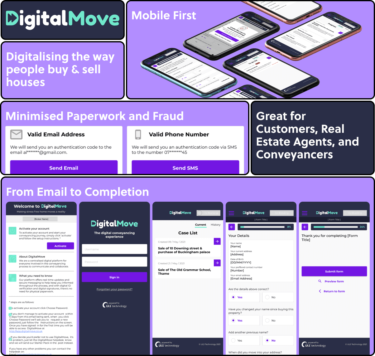
DigitalMove enhances the conveyancing process and addresses concerns raised by consumers, the home moving industry and policy makers. Through a modern, intuitive user interface, DigitalMove provides a more consistent experience and improved security over traditional conveyancing. - Digitalmove.co.uk (2021)
What does DigitalMove do: Lengthy transactions, increased fall throughs, high cost of sales…feel familiar. We share your pain. Most of the stress is caused by poor communication, lack of transparency and slow progress.
Our online platform streamlines the process, removing the need for paper trails, captures key property information upfront identifying motivated buyers and enables immediate customer engagement and real-time updates. The benefits of DigitalMove are:
Effortless Onboarding: DigitalMove enables your clients to complete their initial Upfront Property information online in less than a few minutes. No more time wasted.
Eliminates Paperwork: Fully online platform removes the need for paper trails.
Minimised Risk of Fraud: Our platform removes the need for email communication between stakeholders, leaving fewer opportunities for fraudsters to strike.
ID Verification: DigitalMove allows clients digitally sign documents on their desktop, tablet or mobile device, and provide ID from the comfort of their own home 24/7.
Highlights
I led a research and design process, supported by a talented team of PMs, BAs, and Saleforce developers while working remotely and in the Thame office. Our efforts led to the discovery of valuable user insights, numerous user experience improvements, and a validated long-term design direction for the future development.
Customers are moving in without the traditional stress, by allowing the customer to upload documents, talk to the right parties and being updated in every part of the journey to know exactly what is going on.
Existing value was unlocked, by revamping the design process and navigation to really focus on the needs of customers, conveyancers and estate agents while completing key tasks.
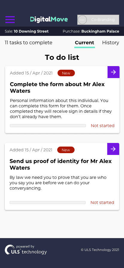
A beautiful, easy-to-understand mobile journey, this is done by designing mobile first (as “The latest figures from Statcounter show that in the UK, mobile and tablet combined account for 52.4% of market share when browsing” (Jeanne Wilkins • Aug 28, 2020)). This statistic is only going to get high as every industry designs for mobile.
The Brief
Before I joined ULS Technology, there was a concept version of DigitalMove developed to see if the process could be done. Once ULS Technology had a roadmap, and a clear understanding of what needed to be done to reshape the moving in industry, then I was brought in. Before working for ULS, I had a very small amount of knowledge on anything about the moving in process. The DigitalMove product is split into 4 journeys, these are: Customer, Estate Agent, Conveyancer, and Moving in. With this in mind, my main objectives were to:
Objectives
Redesign the design system, to help build a easier and consistent journey for customer and other users.
Create a UX/UI process, to help all featured teams help build the product.
Role out a MVP DigitalMove to get data and feedback to help create version 2.
My Process
Research
The research stage in UX design involves gathering information and data about users, their needs, behaviours, and preferences. This information is used to create a user-centred design that meets the needs and goals of the users. Part of the UX role is to find problems to solve, this could be from looking at data to see where users are going wrong, to improving the conversion percentage.After finding a problem or being given a brief, I will look on sites such as Behance, ColletUI or Dribbble for inspiration or comparison with the industry.
Workshop
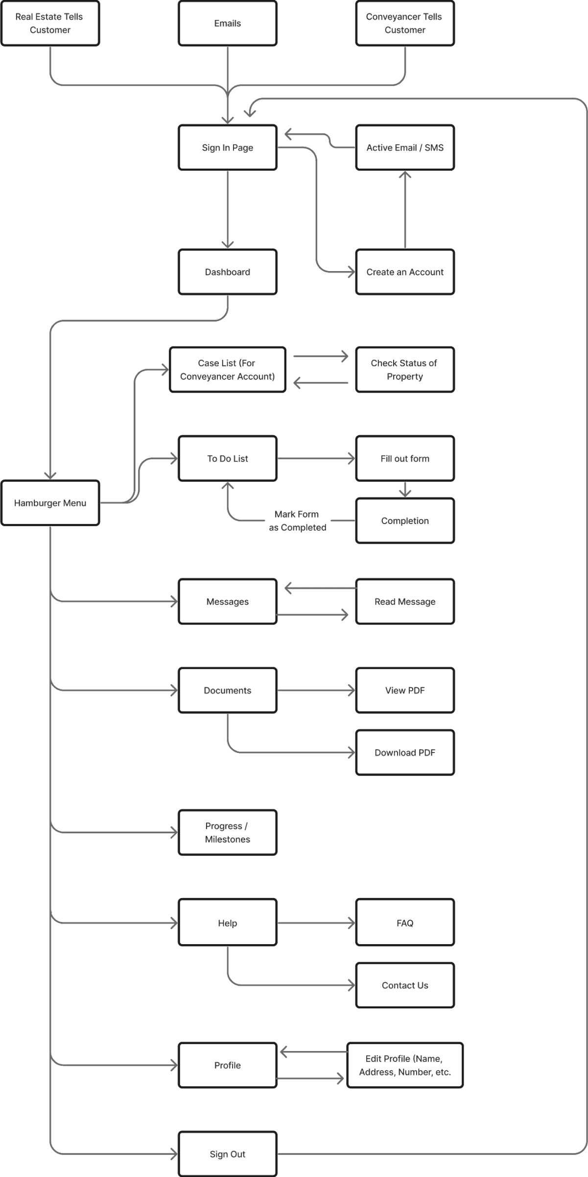
Journey Map
Wireframes
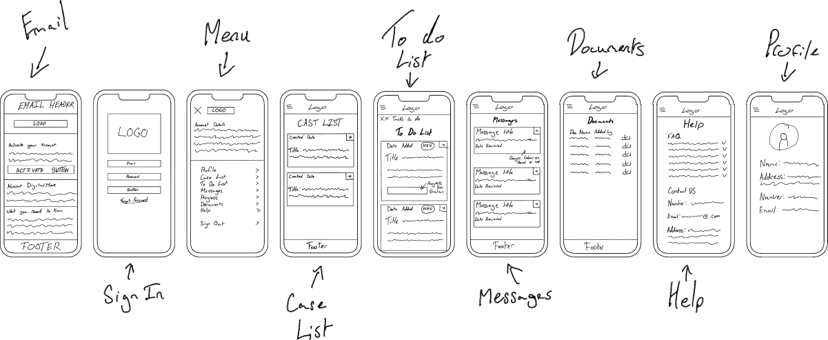
Once I have looked for inspiration or comparison, I will create high level concept art with necessary features to see how the prototype would work. Wireframe ideas to get the best possible outcome for the product. This include mapping out the site and drawing up mockups. As we know all the components from the design system, this allows us to focus on what we want the customer to see and do. The reason for creating these wireframe are:
Define the user flow: Start by mapping out the user flow for your website or application. This means defining the steps that a user will take to accomplish their goals on each page.
Identify the key features and content: Based on the user flow, identify the key features and content that will be included on each page. This will help you determine the layout and hierarchy of the content.
Sketch rough wireframes: Sketch rough wireframes of each page, focusing on the layout and hierarchy of the content. Don't worry about the visual design at this stage.
Refine wireframes: Refine the wireframes based on feedback from stakeholders and user testing. Make sure that the content is easy to read and the user flow is intuitive.
Consider visual design: Once you have the basic layout and content in place, you can start thinking about the visual design of the pages. This includes choosing colors, typography, and other visual elements that will create a cohesive look and feel across the site or application.
Create final wireframes: Use the feedback and input gathered during the refining process to create final wireframes for each page. Make sure that they accurately represent the user flow and include all necessary content.
Roadmap
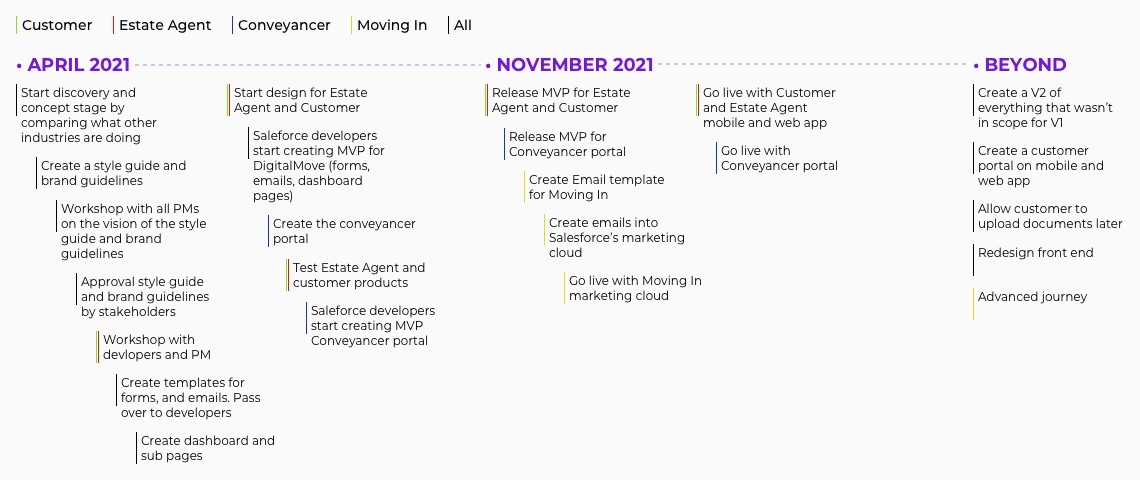
Based on the research findings and customer feedback from the concept version of DigitalMove, the feature team decided to solve client-facing UI issues together with creating a brand new admin/maker experience. Due to the resource limitation, we prioritised the features and allocated the tasks for one big release in November 2021 and from the data and feedback we get, then work on further update and releases after that.
Design & Prototype
After I’m happy with my concept art, I will create a polished design and prototype. This prototype will be uploaded to Invision and can be updated instantly anytime.
First steps
Strip down to the good and bad, and rebuild
After my discovery and concept phase of the UX/UI process, I decided to look at all the components in the main style guide and take out the bad ones, and look at the good ones and see if they can be improved. I also knew that mobile first is a must, as this product is customer focused. This helps me build the new style guide, brand guidelines and component library.
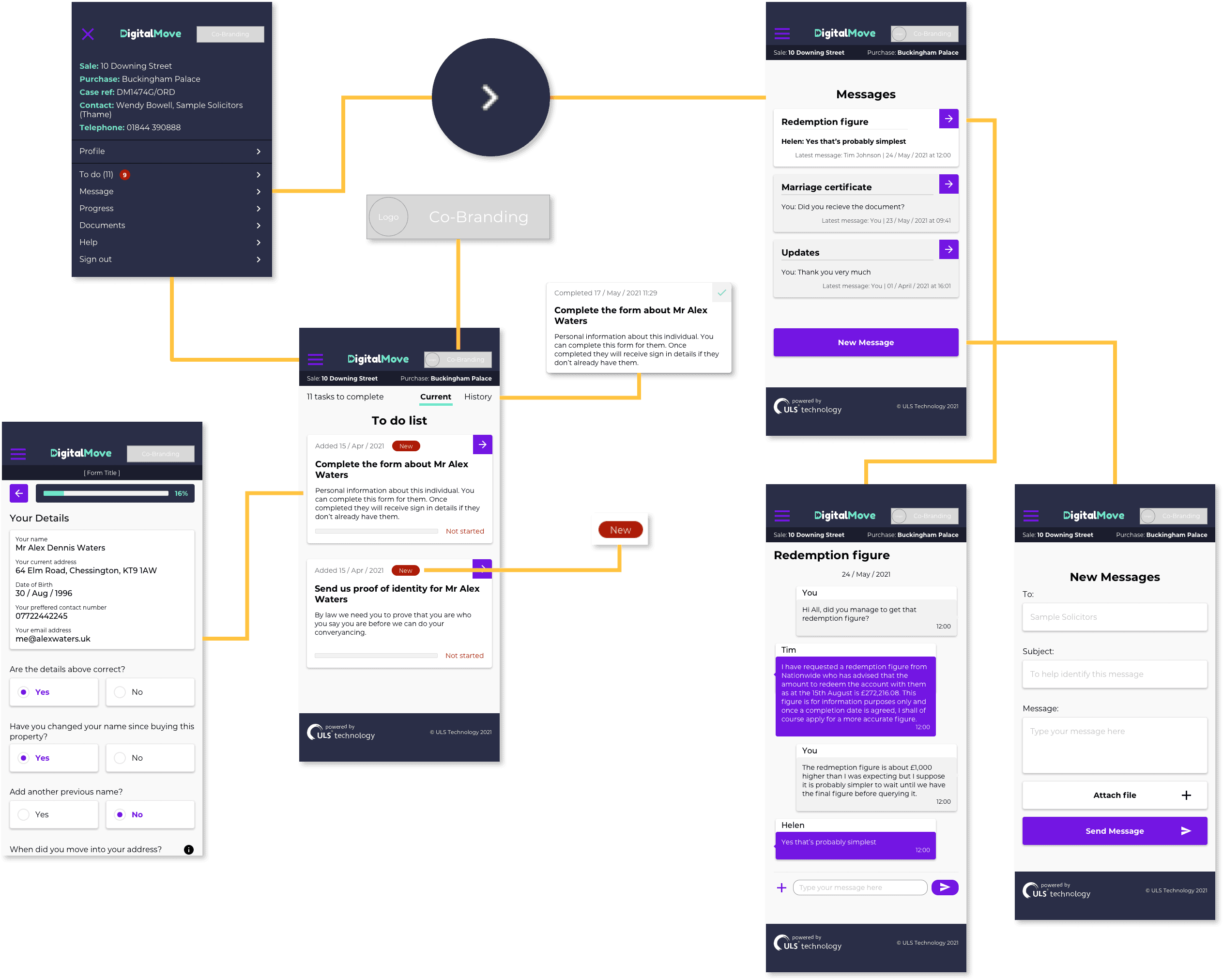
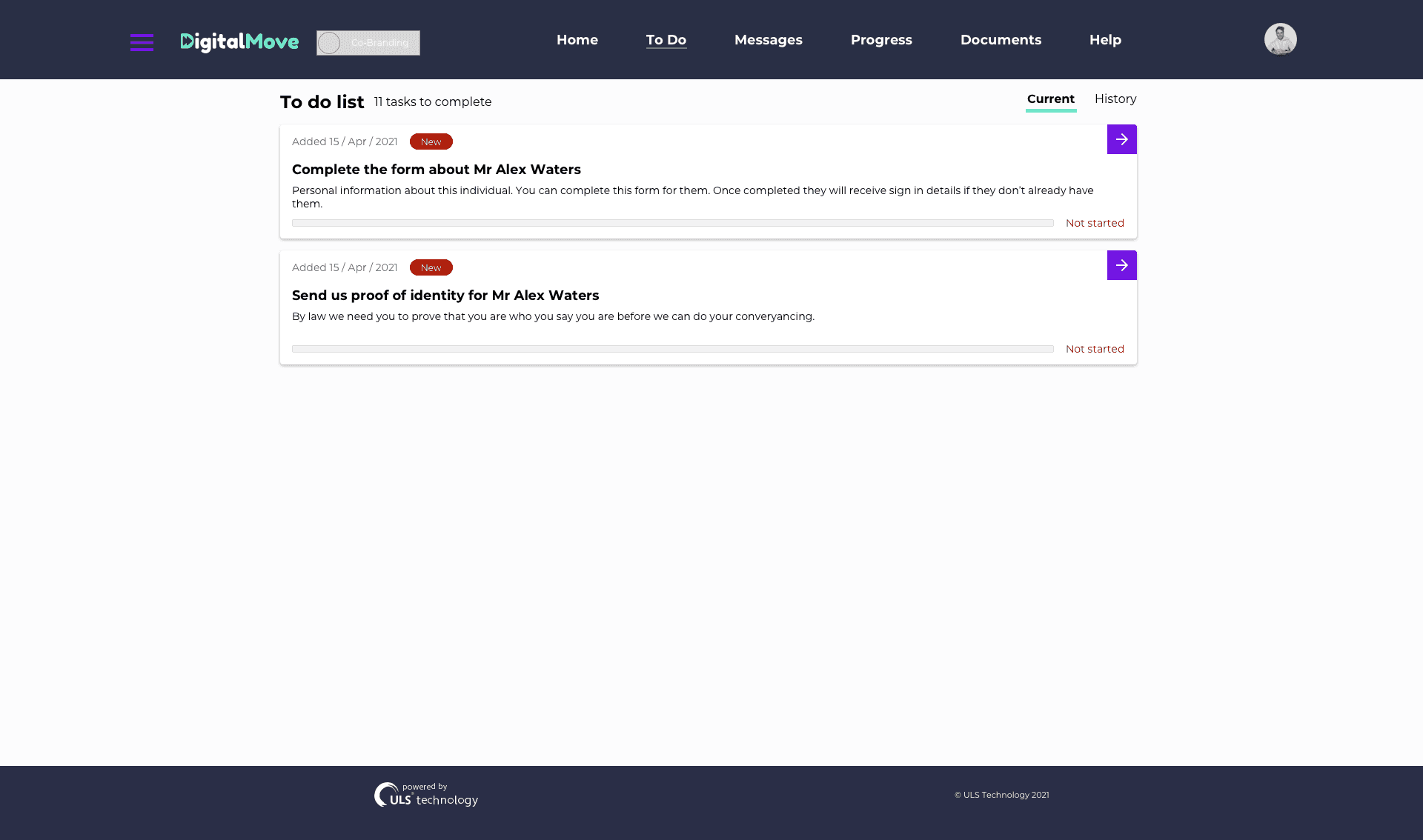
The main way the customer will interact with the dashboard is by completing the tasks on their dashboard that will trigger other tasks. Once all tasks are complete and the tasks are complete from the conveyancer and estate agent then the customer will be ready to move onto the Moving In product. This product is built so the customer can make arrangement such as: setting up broadband, hiring a rental van, and making sure all council bill are set up in the new owners name.
The image you see below is the breakdown of the new design.
Second steps
Design and Prototyping
After researching, concept design and creating the design system. I moved over to design and prototyping, so I would be able to show the stakeholders my vision of what I believe DigitalMove should be. This is done by creating my designs on Sketch and importing them into Invision. This is a great tool to show stakeholders how the customer would interact with the products.
Testing
There were many ways we tested the product was the best fit for our users and that the design meets user needs and expectations. These were:
A/B Testing
Our A/B Tests were for 2 reasons. 1: To see that it is the best for our customers. 2: If 1 was successful then we would sometime push the test to 100% so this wouldn’t demand the developers to code it properly in our production environment. Based on the results of the A/B test, the design team could make a decision on which version of the homepage to implement permanently. A/B testing can help UX designers make data-driven decisions about design elements and optimize a design for specific metrics, such as conversion rates or engagement.
Prototype VS Pre-Production
Most of the time, I will test the prototype i sent to the development team to the pre-production they have sent back to ensure that everything in my prototype is met in there version. The reason for this is so a prototype is a preliminary version of a product created to test and evaluate the design concept, while pre-production is the stage before mass production where the final product design is confirmed, and the production process is established. Prototyping is an iterative process that helps refine and improve the design, while pre-production is focused on ensuring that the product is manufactured at scale according to design specifications.
Heuristic evaluation
Here are the steps we conduct in our heuristic evaluation:
Assemble a team of experts: Gather a team of experts who are familiar with usability principles and have experience with the type of product or service being evaluated.
Choose a set of heuristics: Select a set of established usability principles or guidelines that will be used to evaluate the design. Examples of heuristics include Nielsen's 10 heuristics and Jakob Nielsen's usability guidelines.
Evaluate the design: Each team member should evaluate the design independently, following the set of heuristics. They should take notes on any usability issues or potential areas for improvement.
Compile the results: Compile the results of the evaluation into a single report or spreadsheet, listing each issue or potential improvement identified by the team.
Prioritise the issues: Prioritise the issues based on severity, frequency, and impact on user experience. Identify the most critical issues that need to be addressed first.
Address the issues: Based on the results of the evaluation, the design team should address the identified issues, either through design changes or additional user testing.
Repeat the process: Conduct regular heuristic evaluations throughout the design process to ensure that the product or service meets usability standards and remains user-centred.
Heuristic evaluations can be conducted quickly and inexpensively, making them an excellent method for identifying potential usability issues early in the design process. However, it's important to keep in mind that heuristic evaluations are not a substitute for user testing, and additional user research should be conducted to validate and refine the design.
Analytics
The tool we mainly used in analytics is Google Analytics (GA), as it’s easy to setup with GA tags in the code.
Here how we used GA to test our product was the best fit for our customers:
Understand user behaviour: GA provides insights into how users interact with your website, including which pages they visit, how long they stay on each page, and what actions they take. This information can help you optimise your website for user engagement and conversions.
Measure website performance: GA tracks website performance metrics, such as page load time, bounce rate, and conversion rates. This data helps you identify areas for improvement and measure the impact of changes you make to your website.
Identify traffic sources: GA provides information on the sources of traffic to your website, including search engines, social media, and referral sources. This information helps you identify which marketing channels are most effective and allocate resources accordingly.
Monitor campaigns: GA allows you to track the performance of your marketing campaigns, including email marketing, social media ads, and pay-per-click advertising. This information helps you identify which campaigns are most effective and optimise your marketing efforts.
Customisable reports: GA offers customisable reports and dashboards, so you can track the metrics that are most important to your business. You can also set up alerts to notify you of significant changes in website traffic or user behaviour.
Overall, GA provides valuable insights into website traffic and user behaviour, which can help you optimise your website, improve user experience, and make data-driven decisions about marketing and advertising.


